
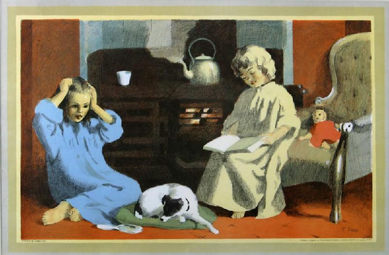
Fireside by Thomas Carr
 |
|
The idea behind School Prints Ltd was brilliant and simple. Commission good artists to create original lithographs which would be editioned in very large numbers and sold cheaply to those schools adventurous enough to subscribe to the scheme. Thus, would it be possible for children in school to enjoy a direct and continuous contact with real works of art. In her introductory letter to artists, Brenda Rawnsley, whose idea it was, wrote 'We are producing a series of auto-lithographs, four for each term, for use in schools, as a means of giving school children an understanding of contemporary art'. If that somewhat ambitious aim were not to be fulfilled, the prints would in any case enliven corridor walls and bring a splash of welcome colour into dull assembly halls. And so they did. For many of those at school in the austere '40s their first memory of a genuine work of art will be of a print by one of the many artists who contributed to the two major series of 1946 and 1947.
The scheme was nurtured by the prevailing atmosphere of post-war optimism and democratic humanism: the future was what mattered, and the children in school embodied that future. The artists approached responded enthusiastically, and an impressive number of them were prepared to submit sketches to the selection committee enlisted by the tireless Mrs Rawnsley. It was chaired by Herbert Read, and it included R.R. Tomlinson, the influential L.C.C. Senior Inspector of Art. The committee was not afraid to turn down work by established artists that it considered unsuitable. The records of its dealings with artists show no evidence of ill-feeling on their part at the committee's willingness to offer advice on matters of composition or subject matter. (Brenda Rawnsley still possesses the brilliant sketch of the Cat and the Fiddle by Michael Ayrton, which the committee felt would be too frightening as a full-size lithograph.)
The spirit which pervades the published prints is of quiet celebration: they picture a world reassuring in its familiarities; a world of everyday work and occasional festivity. It is a spirit in keeping with the general optimism of the project. The best of these prints present images of perennial rural and small-town life: they are versions of pastoral. Fields are ploughed and harvested (Kenneth Rowntree, Tractor; John Nash, Harvesting); trees are felled (Michael Rothenstein, Timber Felling); nets are mended for the next fishing (Julian Trevelyan, Harbour); horses are groomed, and deliver beer to local pubs (John Skeaping, Mare and Foal; Tom Gentleman, The Grey Horses). For high days and holidays there is the circus (Clarke Hutton, Harlequinade; Russell Reeve, The Circus), the fair (Barbara Jones, Fairground) and the outing (Edwin La Dell, Tower of London). Nowhere is there any reference to the late war and its devastations. Colours are bright and cheerful. The drawn frame round each picture meant that the print could be pinned directly to the wall.
Inevitably, there is a wide variation of quality within the series. Some have little more than a period charm (which may increase their interest as nostalgia catches up with the '40s), others are merely dull; but some have survived remarkably well (including those mentioned above) and a small number are very good prints indeed. These latter include works by John Nash [Harvesting, Window Plants], John Tunnard [Holiday], Lowry [Punch and Judy] and Moore [Sculptural Objects]. In Nash's Window Plants the old lady dozing is engulfed by the exuberant plants, her heart imaged in the bright red geranium at her breast, her sleeping cat echoing the striped partridge-breast cactus on the sill. It is a comically extravagant image, full of incidental wit and exactly observed detail. Tunnard's Holiday shows him in his best vein of semi-abstract surrealist fantasy. This was worked on the stone by the indefatigable Mr Griffiths at the Baynard Press.
Moore's magisterial Sculptural Objects was drawn by the artist direct on to plastic plates newly developed by Cowells of Ipswich, and proofed under his supervision. This print was one of Moore's earliest graphics and it remains one of his best: powerfully drawn in primary colours, the objects like strange toys abandoned in a mysterious space; it is a compelling image.
The sheer logistics of the operation, the costly effort of distribution to over 4000 schools, finally ended the great adventure of the School Prints scheme. A further disheartening factor was the expensive flop in 1949 of the magnificent European series, made possible by the plastic portable plates, which, in addition to Moore, featured Matisse, Picasso, Leger, Dufy and Braque.
The now incredible negative reaction of her subscribers to this spectacularly imaginative enterprise must have put in doubt the idealistic ambition of the original idea, but it could not detract from a unique achievement. School Prints put genuine works of art of real quality into the lives of many children in visually hard times. There has been nothing like it since.
Mel Gooding