
Spring Camp 2018
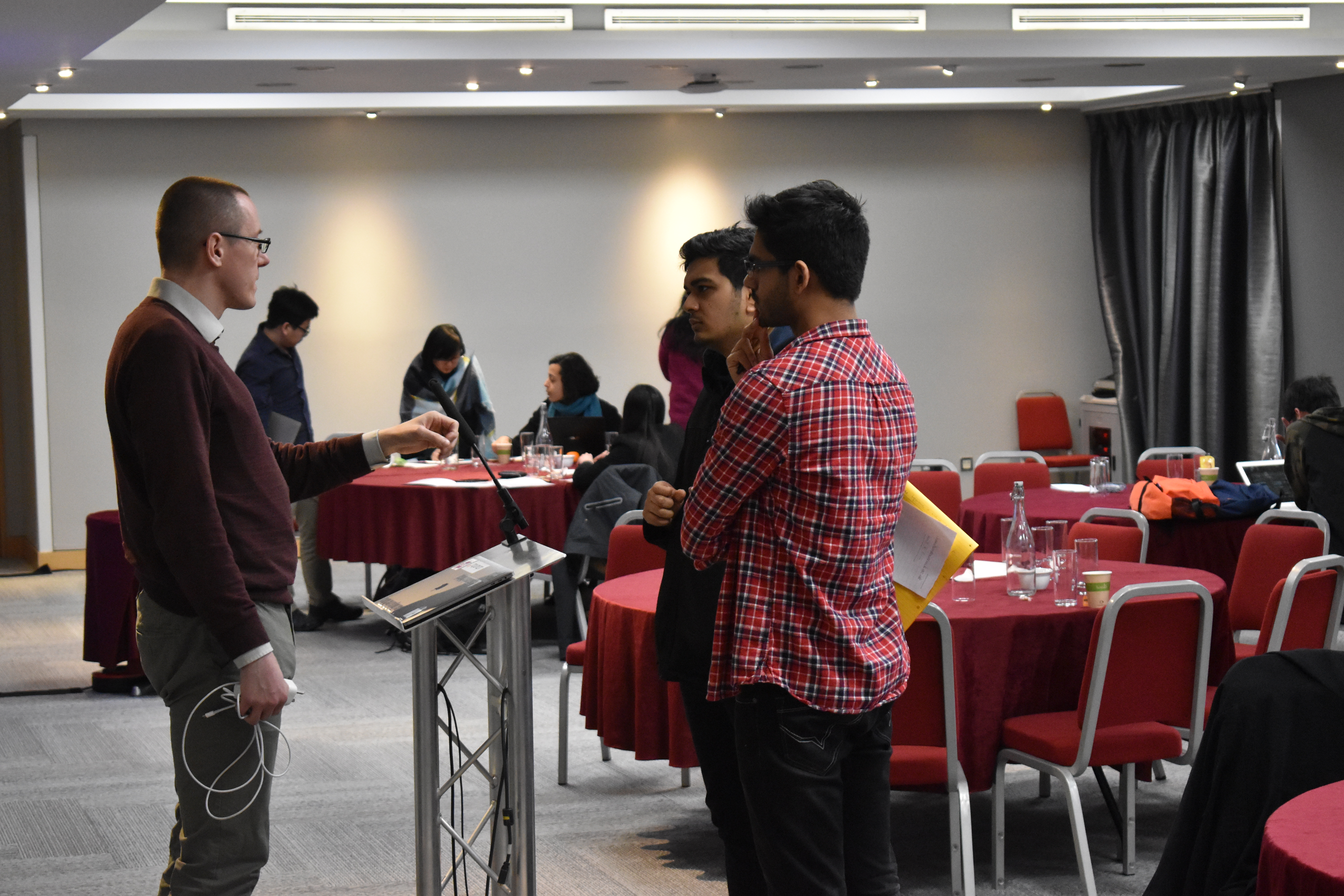
On 19 and 20 March 2018 Warwick Q-Step Centre hosted its third annual Quantitative Methods Spring Camp on the theme of Data Visualisation. The event was a great success and we saw our highest attendance rate yet in our Spring Camp series.
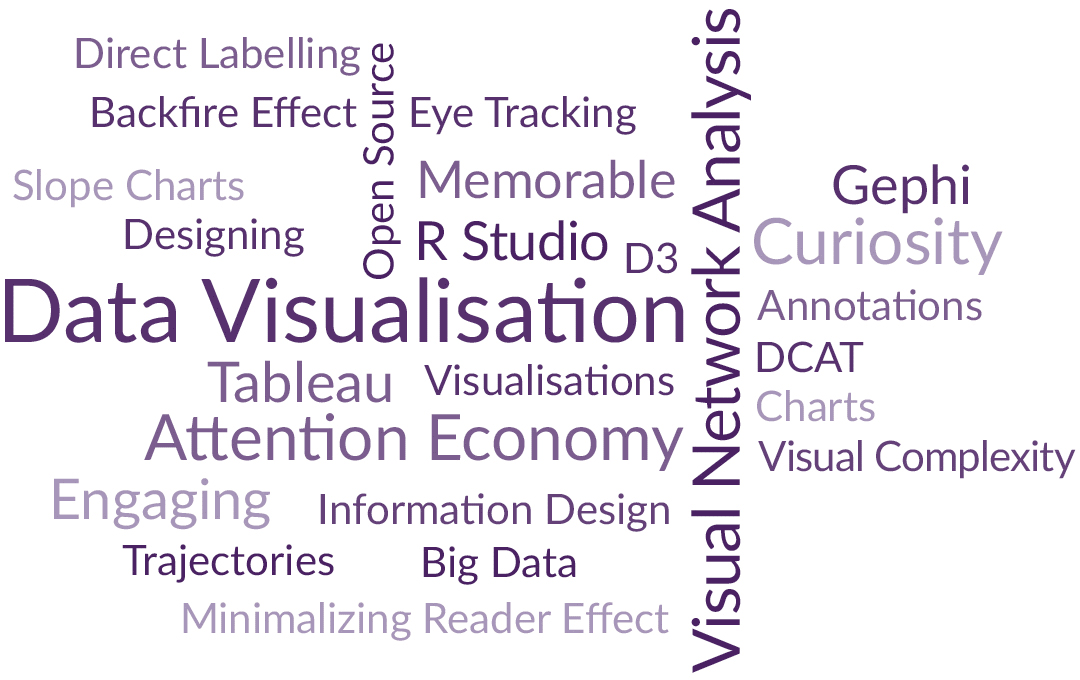
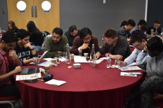
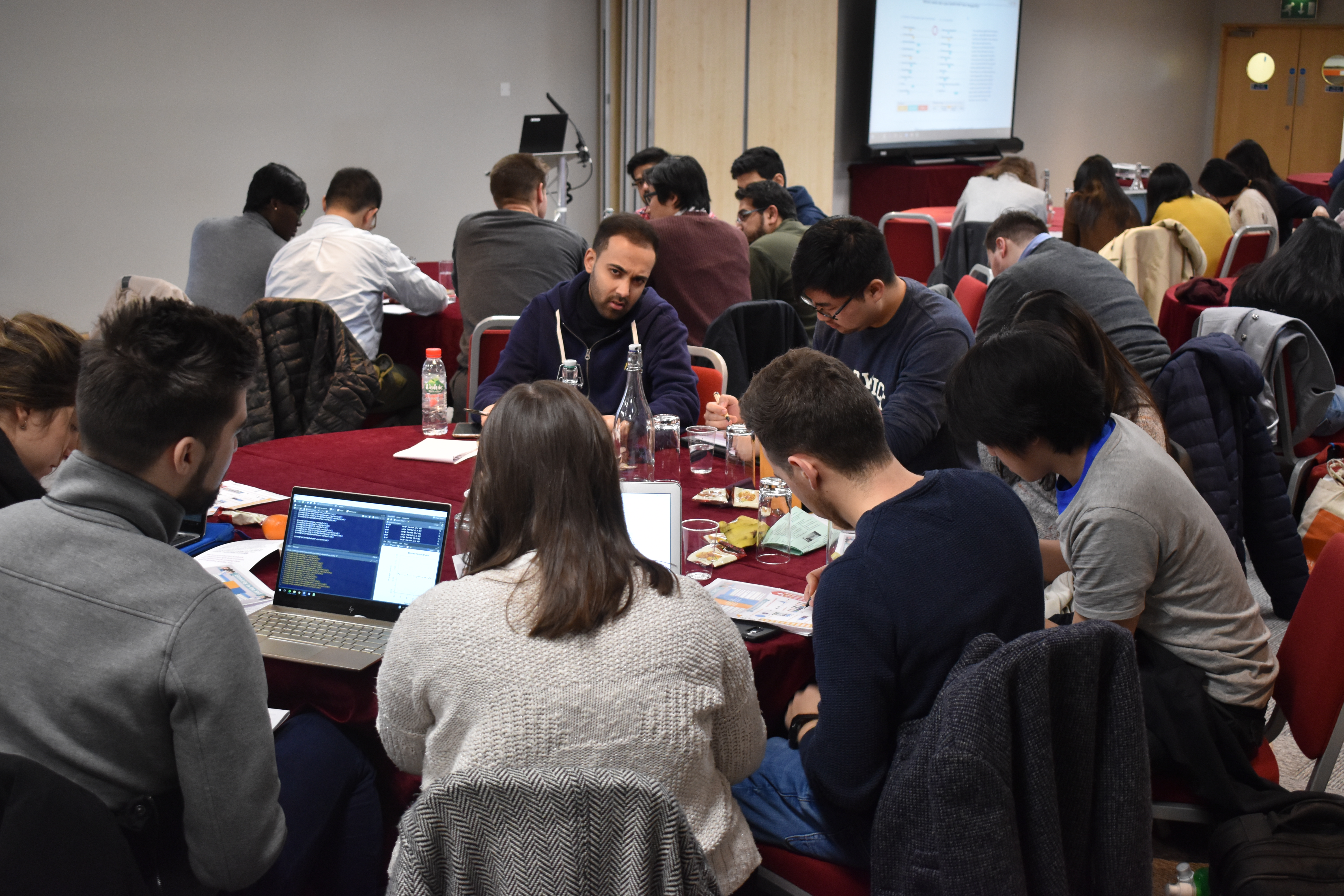
Both undergraduate and postgraduate students came together from across a number of different disciplines within the university to hear engaging, informative and inspiring talks from our guest speakers who shared their expertise on using data visualisation in their respective fields. On Day 2 students also had the opportunity to engage in an interactive workshop using Tableau where they were able to gain both a theoretical grounding in the software before applying what they had learnt to real-life case studies.
Really interesting and informative! I especially appreciated the fact that the speakers came from both academia and industry. One thing I also enjoyed was the focus on real-life situations and challenges.
Spring Camp Participant 2018
It was an excellent opportunity for me to gain experience not only in Tableau but in data visualisation’s application in the real world.
Spring Camp Participant 2018
I really enjoyed both days of the Spring Camp. The speakers were all interesting and gave different perspectives on data visualisation.
Spring Camp Participant 2018
Spring Camp 2018 Programme
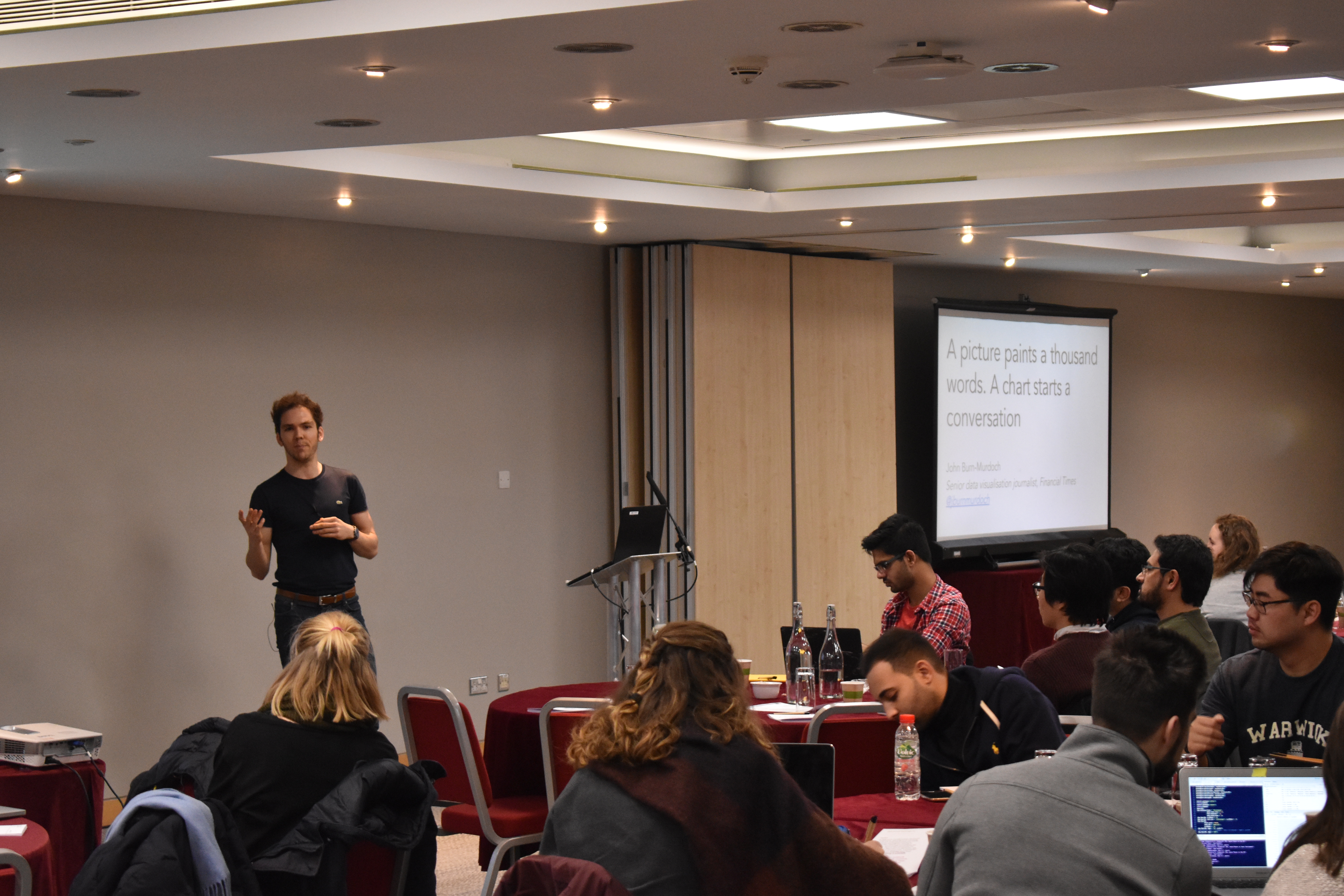
John Burn-Murdoch, Senior Data-Visualisation Journalist & Baseline Columnist at the Financial Times
A picture may paint a thousand words, but a chart starts a conversation
John Burn-Murdoch, 29, is a senior data visualisation journalist at the Financial Times, where he uses statistical analysis and graphics to find and tell stories on a range of subjects including politics, demographics and sports. Before joining the FT in 2013, John was a data journalist with the Guardian's Datablog, which he joined after studying geography at Durham University and completing a master's degree in interactive journalism at City University, London.
Dr Cath Sleeman, Quantitative Research Fellow at Nesta
Data visualisation in practice
Dr Cath Sleeman is the Quantitative Research Fellow at Nesta. She works on issues related to education and the creative economy. Her primary focus is on communicating insights from big data by creating data visualisations. Prior to Nesta, Cath was a Gates Scholar at Cambridge, completing a PhD in Economics. She has also worked for two years as a UK Economist at Morgan Stanley and for four years as a Senior Economic Analyst at the Reserve Bank of New Zealand.
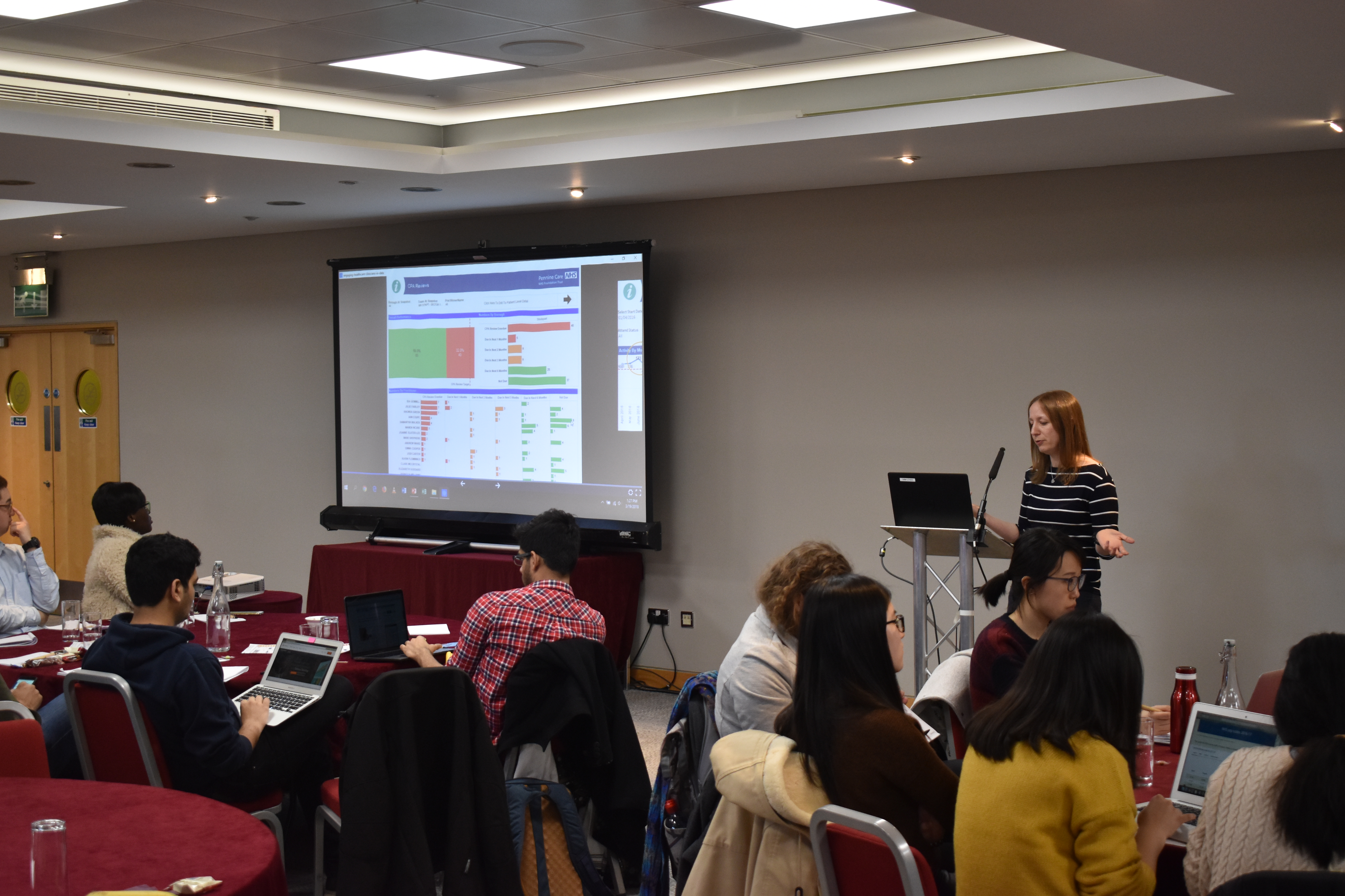
Ella Worsdale, Head of Information at Pennine Care NHS Foundation Trust
Engaging healthcare clinicians in data
Ella Worsdale has been working at Pennine Care NHS Foundation Trust, one of the largest Community and Mental Health services providers in the UK, for over 13 years and has progressed from Information Analyst to Head of Information. Ella discovered Tableau (a data visualisation tool) over three years ago and immediately visioned a new informatics tool for a changing NHS Trust. Ella has since implemented Tableau across the Trust to over 700 clinical and corporate leads. Tableau implementationis now regarded as one of the most important shifts in culture in the Trust; true evidence based practice.
Loup Cellard, Designer and PhD Student at the Centre for Interdisciplinary, University of Warwick
Mapping scientific affinities through temporal networks
Loup Cellard is a Designer and PhD student at the Centre for Interdisciplinary Methodologies (Warwick University, UK). Loup worked as a data visualisation designer at Medialab Sciences-Po (Paris, FR) and at the Digital Humanities Lab of EPFL (Swiss Federal Institute of Technology in Lausanne). The aim of his PhD is to understand how digital technologies and design cultures order the enactment of transparency in society.
Dr James Tripp, Academic Technologist at the Centre for Interdisciplinary Methodologies, University of Warwick
Open source visualisation: a tale of tools
Dr James Tripp is an Academic Technologist at the Centre for Interdisciplinary Methodologies, Warwick. He works with a variety of programming languages in manipulating and visualising data, developing innovative workshops and maintaining linux systems. James' PhD training is in cognitive science and he maintains a passion for programming, data analysis, visualisation and the adoption of interesting open source technologies.
Rachel Wilkerson and Keneth LimDepartment of Statistics, University of Warwick
Tableau Workshop - Day 2
Tableau is a powerful tool for exploring and visualizing data. This workshop, led by researchers from the Deprtment of Statistics, covered the Tableau workflow from initially connecting to data to publishing content online. Participants were given the opportunity to acquire a working knowledge of Tableau by producing dashboards and data stories.