
Case study: redesigning the Warwick Graduate School website
The Graduate School website supports excellence in postgraduate study at Warwick. Prospective and current students, staff and external examiners access the site, so it's very much outward facing.
The site holds practical and useful information on completing research and taught degree programmes, points of contact, scholarships and funding opportunities, procedures and regulations, professional development, community building and events. It's expected to be the single online portal for all those interested, or a current student, in postgraduate study.
The Graduate School team wanted to make the website as user-friendly as possible. Discussing the site at a Postgraduate Administrator lunch, they felt that:
- the navigation menu labels were not programme-specific and could be confusing – for example, Your feedback and Guiding you through
- there was duplicate information in many places
- some pages weren’t used
- finding items required multiple clicks, which could be streamlined
The Graduate School home page and navigation menu before the redesign
The brief
The Graduate School team reviewed the site's goals. They wanted a succinct portal with all the necessary and pertinent information signposted clearly, as well as a fresh new look. Our remit included:
- change the generic navigation menu labels to three areas: postgraduate research, postgraduate taught, and staff and external examiners
- refresh the colour palette and border images
- restructure the pages about scholarship information
- complete the work before the start of the 2018-19 academic year in readiness for enrolment
Goals
The overarching aims of the site are to:
- ensure students and staff can find information easily and with a minimum of clicks to get to the right place
- advertise all the opportunities available for postgraduates
- ensure postgraduates and staff have the correct information available
Build
We created a bespoke site design and three slides, as well as custom page layouts for the home page and key landing pages including a scholarship template. We advised on how to restructure the website content and supported the team after the migration with queries that arose.

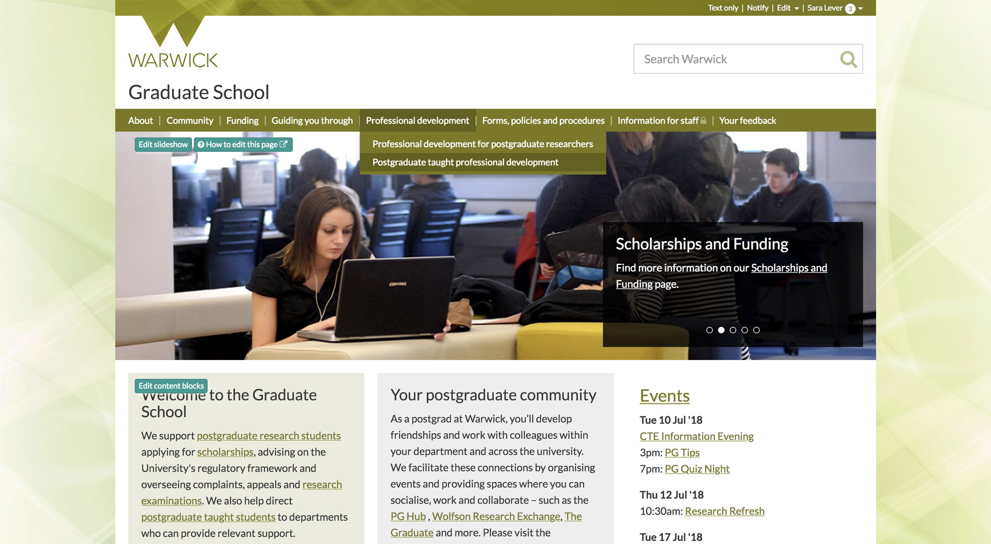
The redesigned Graduate School home page
The result
The Graduate School team said:
We were extremely pleased with our end design and structure, and the professionalism of the web team and in particular Sara Lever throughout!
We were given a number of options within each section of our brief which allowed us flexibility and were also allowed to steer how we wanted to migrate the information. Our deadline was met and we launched before the start of the academic year, which was very important to us with the new cohort. We also wanted an archiving element in case any items not included, but that may be required, could be moved after the launch. This was not a problem from the ITS Web Team at all.
Feedback from users – even though many had to change links within handbooks, and so on – has been very positive as information has been streamlined. So, for example a PGR now doesn't have to go to the Forms, Policies and Procedures page and find which are relevant just to them – this now all feeds off the PGR heading. We've also been able to do a complete site overhaul and this also helped in:
- bringing together signposting to support functions
- putting all the regulations on one page
Our exciting new design is specific to the Graduate School and one we felt would be useful at the time of a new site launch. We can continue these visuals with our marketing and dissemination of information. We had a few ideas for this and were really pleased with the options we received, but also the input we were allowed to have between what we wanted to convey and the Web Team's designers.
On the scholarship pages – for the number we hold and look after internally (10+) – the new template page allows us to copy the structure so that users can easily see the information and follow application processes. Having a similar template gives a clear and defined structure that users can become familiar with.
All in all – we were pleased with the professionalism, timelines and our end result! Our many thanks.