Best practice: Creating inclusive PowerPoint presentations
As PowerPoint is one of the most commonly used programmes in teaching, it is important that the presentations we create are suitable for all to use. Please be aware that some learners may require additional adjustments and you are encouraged to discuss these with them on a case by case basis (rather than making assumptions about what they need or do not need).
General Guidelines
- Slides should have a pastel-coloured background to eliminate glare, avoid white backgrounds.
- Use single colour backgrounds and avoid patterns as these can be distracting.
- Text should be dark and provide sufficient contrast to the background colour, use one font colour for each section.
- Avoid red, pink and green text as this can be problematic for individuals with a colour vision impairment.
- Use a simple font for all text, Arial, Verdana and Tahoma all have a high accessibility rating.
- Avoid large blocks of text and limit the number of words on each slide.
- Use bullet points rather than continuous prose.
- Aim for a font size in excess of 18, although this may not be possible in all instances.
- Break up the text with regular section headings and use bold text to indicate headings, underlining and italics should be avoided as it can make the letters and words run together.
- Avoid block capitals on slides as they can be difficult to interpret.
- Use the accessibility checker in power point to support.
Language
Ensure any text on your slides is large enough to read. If in doubt spread the text across several slides and use a plain (san serif) font. Kunstler Script or Vivaldi may look pretty, but no-one in your audience will thank you for using these fonts. Use a glossary for specific terms and always explain acronyms when you first use them. Keep your sentences short and the language you use simple.
Colour
Do not use colour as the only way of conveying meaning. If you want to use colour you should always provide a text alternative for learners with visual impairments. In the first table below, the mandatory module is shown in red and the optional module is shown in green. This is not suitable for learners with red/green colour blindness or for learners who rely on screen readers, as the colours will not be picked up by the software.
| Introduction to grammar |
| Intermediate grammar |
A simple accessible alternative is:
| Introduction to grammar (mandatory) |
| Intermediate grammar (optional) |
Transitions and animations
Transitions and animations should be simple (or better yet avoided completely). Flashing animations can be distracting and can sometimes induce seizures in learners with certain conditions. It is good practice to provide text alternative versions of presentations in accessible PDF format as these are much smaller than the original presentations and therefore quicker and easier to download. Additionally specific software is not required to access these files. PDF documents will not display animations or transitions so think carefully about whether you really need to use them when creating your presentation. Also webinar software such as Blackboard Collaborate creates an image of each slide when you upload it, therefore any animations will be removed at this point.
Video and audio files
The guidance on using video and audio files in presentations is the same as the more general guidance on using this type of content. Please see the accessibility page for further information.
Visual content
Visual content includes images, SmartArt graphics, shapes, groups, charts, embedded objects and ink. The guidance on using visual content in presentations is the same as the more general guidance on using this type of content. Please see the accessibility page for further information.
Themes
When creating a presentation try to only use the built-in themes and colours to change how your presentation looks. These are available on the Design ribbon in PowerPoint. However, not all of the options displayed are suitable for all learners. Some of the themes have poor contrast between text and background and some of them have busy backgrounds that can make the slide content difficult to read. For example reading from left to right on the image below:
- the text on the first slide is much easier to read than the text on the third slide (black text on a white background is generally easier to read than green text on a white background)
- likewise the text on the first slide is much easier to read than the text on the fifth slide (the blue and white background pattern)
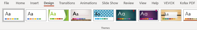
If you are planning to make printed copies of your presentation available as well as displaying it on a projector or laptop screen, you need to ensure that both versions of the presentation are equally accessible for your learners. What works on a screen may not work in printed form (and vice versa) so always check both versions for text contrast and background readability. On the image above the seventh slide from the left (the white text on the purple background) would probably work well on a projector or laptop screen but it would be difficult to read on a printed version.
Slide layout
You should always use the pre-formatted slide Layout menu in PowerPoint to format the content on your slides. This is really important from an accessibility perspective as it is the slide layout that screen readers use to format the order in which they read the content of the slide. If you add in extra formatting options (e.g. text boxes), these can cause the screen readers to read the content in the wrong order which will make your presentation incomprehensible.
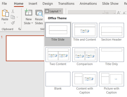
Most of the built-in slide layouts have a slide title (normally near the top of the slide) and one or more placeholders where you can add text, images, tables etc. When using screen readers, this title is treated as a heading and will be the first item read out on a slide. Additionally, using a descriptive title (not just slide one, slide two etc.) will make the presentation much easier to follow for screen reader users.
Slide reading order
If it is not possible to use the slide layout option described above, then you can manually change the order of the items on each slide using the Selection Pane on the Home>Arrange dropdown menu. This will display the Selection Pane on the right hand side of your screen. Each piece of content that you have on your slide will be displayed on the pane. Be aware that the reading order for the content is from the bottom up (which seems counterintuitive at first but you do get used to it). To move an item,
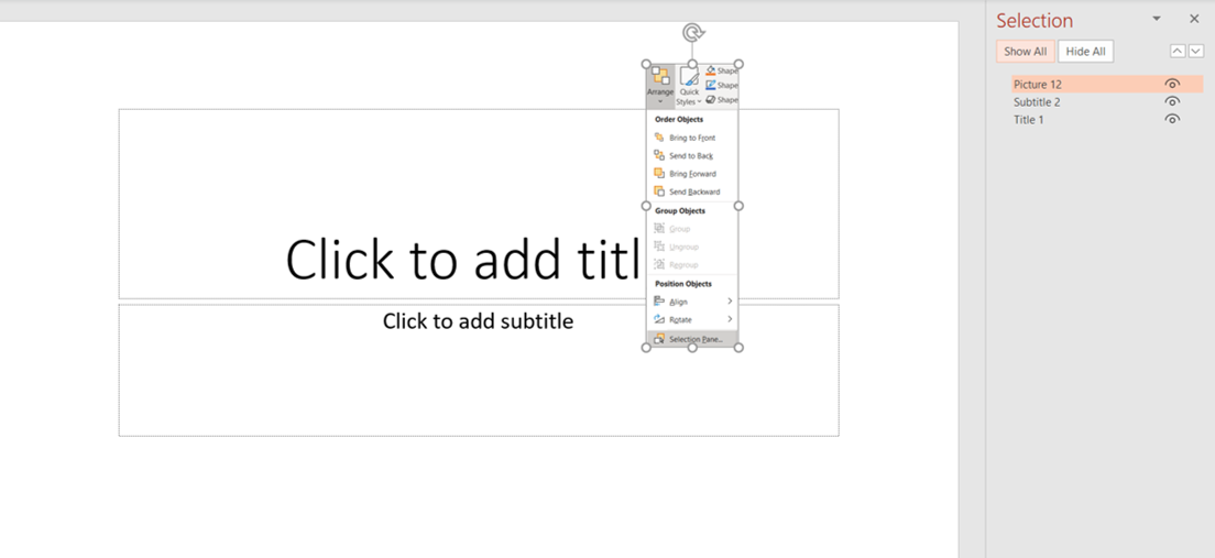
As you can see on the slide above, Title 1 is the main title textbox and this is at the bottom of the list so it will be read first by any screen reader. Subtitle 2 is the lower textbox and this will be read next and then the image which shows as picture 12 on the list will be 'read' last of all. The image would need to have alt text attached to it explaining what it is and this it what the screen reader will process. Further information about making images accessible is available on the accessibility page.
Tables
Keep your tables as simple as possible and do not use nested tables (tables embedded within tables) as this is really poor practice from an accessibility perspective. One of the down sides with PowerPoint is that it is easy to set up tables without column and row headers. Whilst some screen readers will not identify table headers in PowerPoint anyway, it is still recommended that you identify table headers visually as it is a good habit to get into regardless of this; particularly if you are planning to convert your presentation into an accessible PDF document.
Add your table to your slide and then click in one of the cells to activate the Table Design ribbon. In the Table Style Options section on the far left of the ribbon, make sure that the Header Row checkbox is ticked. If you also want to add headings to the first column, add a tick to the First Column checkbox as well.
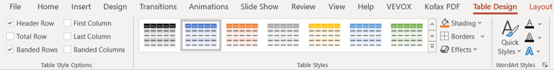
It is good practice to ensure that any Table Style that you choose has good contrast between individual rows and the table background and the text they contain. Finally, avoid splitting and merging cells within tables as the content in these types of cells is difficult for screen readers to interpret.
Hyperlinks
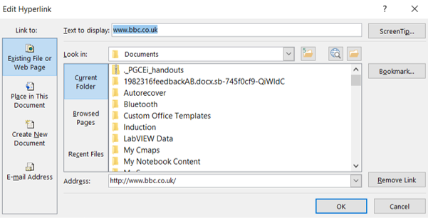
When you type a URL onto a slide, PowerPoint will recognise it and convert it into a clickable link. This is really convenient but these links frequently do not make much sense and are difficult for screen readers to interpret. A more accessible option is to edit the link text to make it more descriptive. Once you have added a URL to a page and it has been converted into a link, right click on it and choose Edit link from the drop down menu.
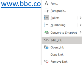
Change the text in the Text to display: field at the top of the dialogue box that appears and then click on OK.
Alternatively you can include a very clear description either above or below the link to explain what will happen when it is clicked on.
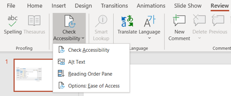
Accessibility checker
Microsoft PowerPoint has a built in accessibility checker that you can use to check how accessible your presentation is before you use it. Whilst this should not be solely relied upon, it does check the most basic accessibility components. To access it, click on the Review tab and then click on the Check Accessibility button on the ribbon.