How to use our colours
The University of Warwick colours
With aubergine acting as our primary brand colour supported by our secondary and tertiary brand palette, we aim to provide flexibility for colleagues to distinguish themselves while being consistent with the main brand.
Colour palette
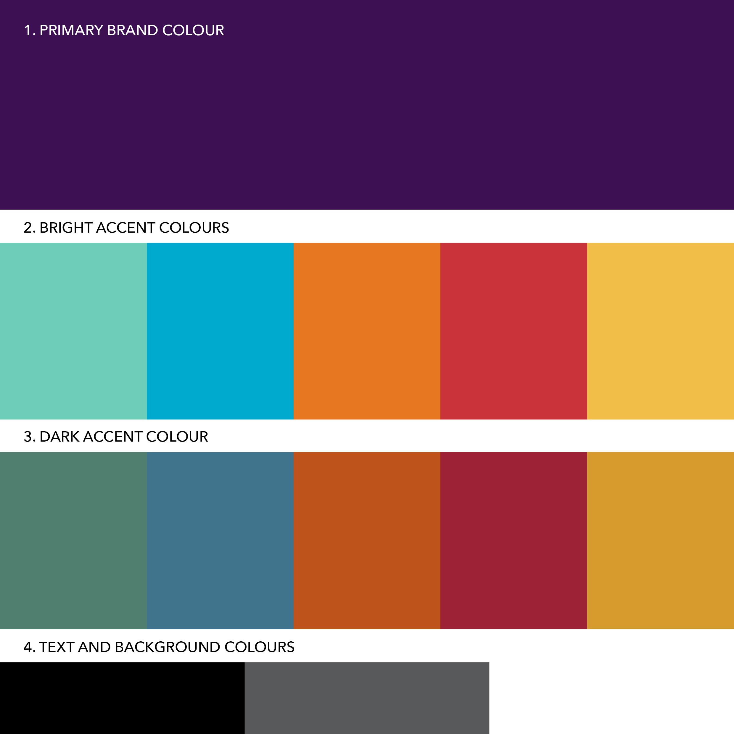
Our colour palette creates unity and structure.
Aubergine sits at the top as our primary brand colour (1).
The next layer is our secondary brand palette (2), offering bright accent colours.
The third layer is our tertiary brand palette (3), made up of dark accent colours.
Black, grey and white (4) are used for text and backgrounds.
Using our brand colour values
Here are the colour values for our brand colour palette. Use RGB and Hex for digital, and use CMYK or Pantone for print.
Where possible, we adopt the ‘three colour rule’ in our designs, meaning the use of no more than three colours from the palette in a single layout. We recommend selecting one colour from each tier for maximum impact. While aubergine is preferred, it is not essential to use it on every design.
Grey*, black or white should be used for body text and backgrounds only. Three further colours from the palette can be used in conjunction with the body text and background colours.
Tints of the colour palette can be used, as long as legibility of information is considered. For consistency, we recommend using tints of 80%, 50% or 20% for print, and 70%, 50% or 30% in digital applications - 80%, 20% or 10% for digital grey.
Please note that our palette is optimised for printing using CMYK four-colour process and should therefore be used for all print items. Pantone is intended for merchandise where a single spot colour may be required.
* Body text grey should be produced by using an 80% tint of CMYK Black.
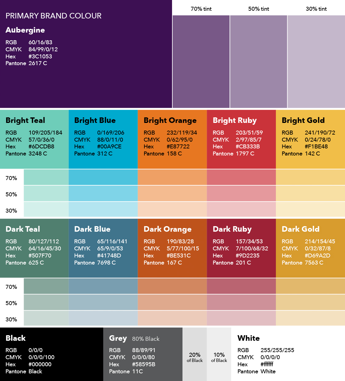
The below codes are recommended to be used in digital and web applications.
Aubergine RGB 60/16/83 or Hex #3C1053.
How to use our colours
Here are some examples of best practice colour usage and advice on finding a good balance of colour within a design.
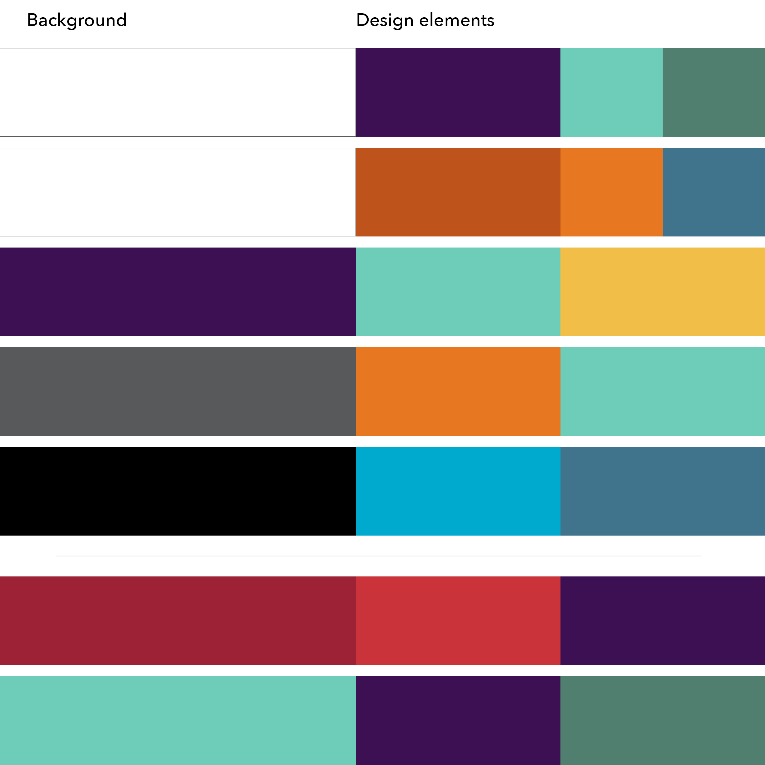
Our communications normally start with a white or aubergine background, with other colours used to support a design (1). We can also use black or grey as a background colour.
A secondary or tertiary colour should be used for supporting design elements or key messaging text, with one more colour used sparingly to highlight content or add dynamism.
Less frequently, we can use other colours as a background (2), but only where legibility of text is strong.
Please note that printed colours reproduce slightly differently on different paper stocks. For improved colour consistency, we recommend using an uncoated stock.
Accessibility
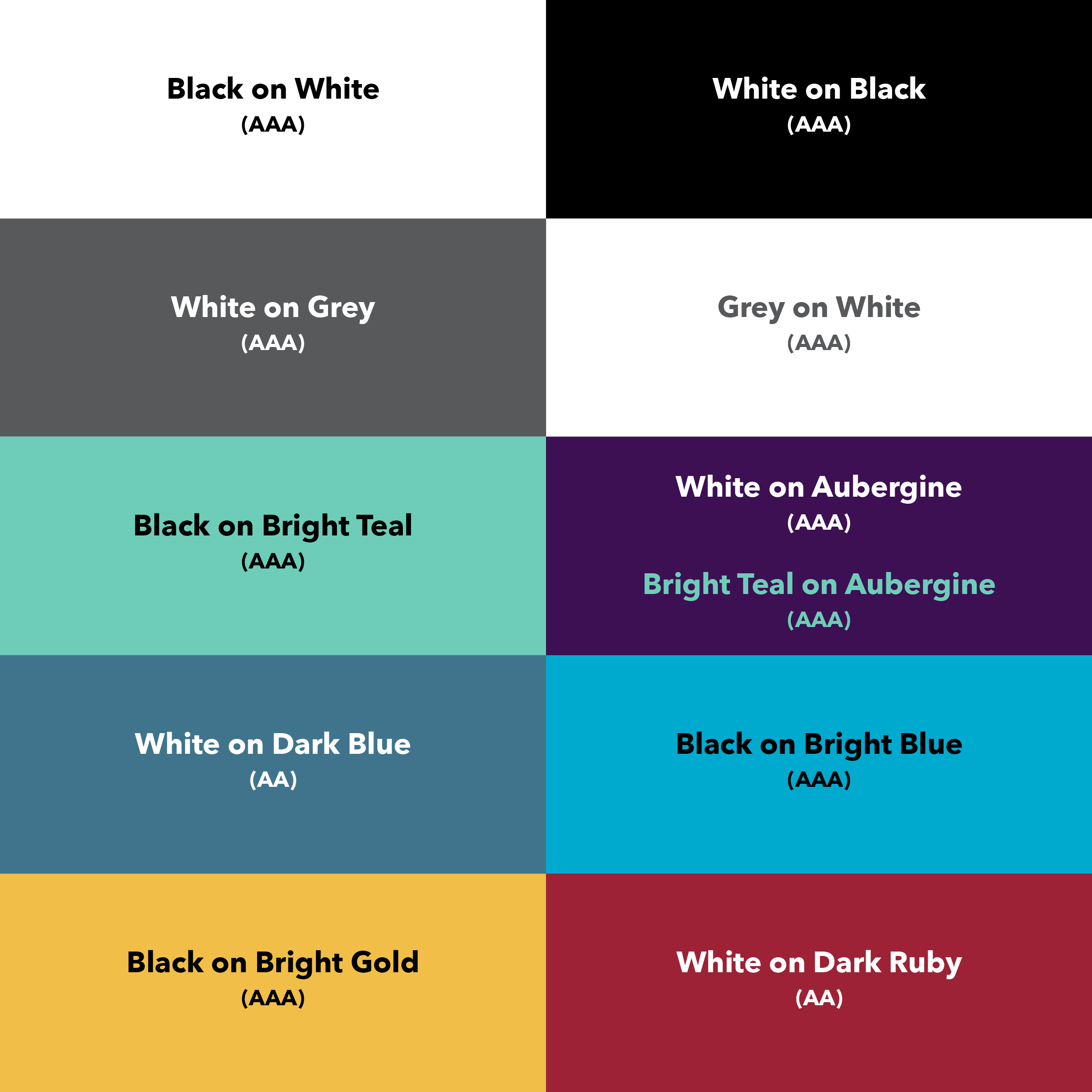
It is vital that our brand colours are used in a way that maximises legibility to ensure our designs are accessible to as many people as possible.
Here are some recommended colour pairings that will maintain the readability of text by providing strong contrast.
All of these pairings comply with the AA level contrast of at least 4.5:1, while many also adhere to the AAA level contrast of 7:1.
The level is noted so the most suitable pairing can be chosen depending on the application. We would advise only using AA level for larger text (16pt and above) and AAA level on all other text.