
Typography
The University of Warwick typography
Using a consistent font helps to strengthen our brand identity throughout all of our communications. Our primary brand font is Avenir Next, chosen for its clarity and legibility. This font should be used for all professionally designed communications and assets, but we do have alternatives available to be used in certain circumstances.
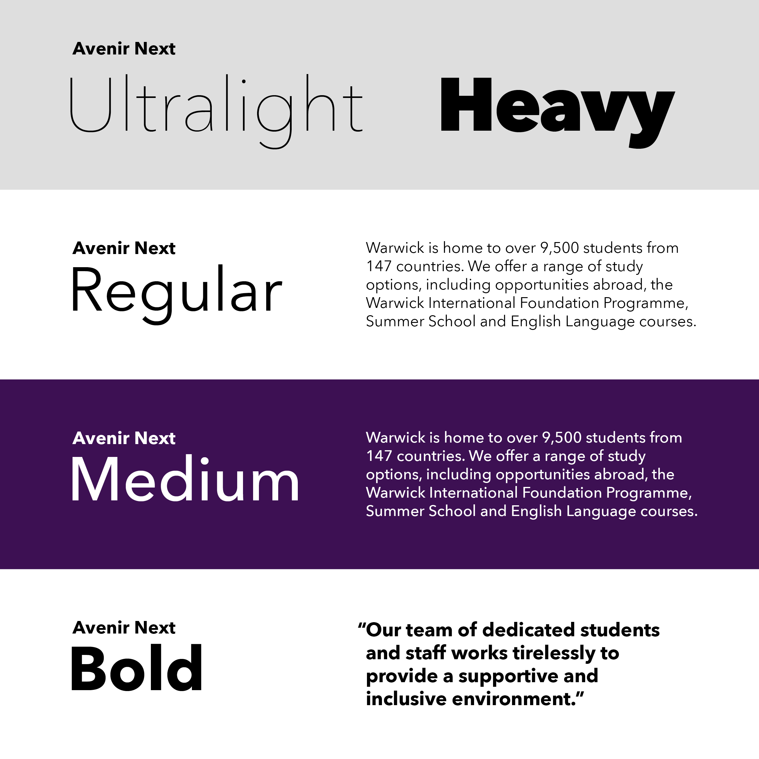
Primary brand font - Avenir Next
As part of the standard font set within Adobe Creative Suite, the professional designers we work with should all have access to this font.
Ultra Light should only be used on large key messaging (40pt and above). Its elegance works well at scale but can become illegible in small text applications.
Regular should be used for body text on a light background, whereas Medium is preferred on a dark background.
Bold should be used in pull-out quotes, headers and subheads.
Please click on the image to enlarge.
Alternative fonts
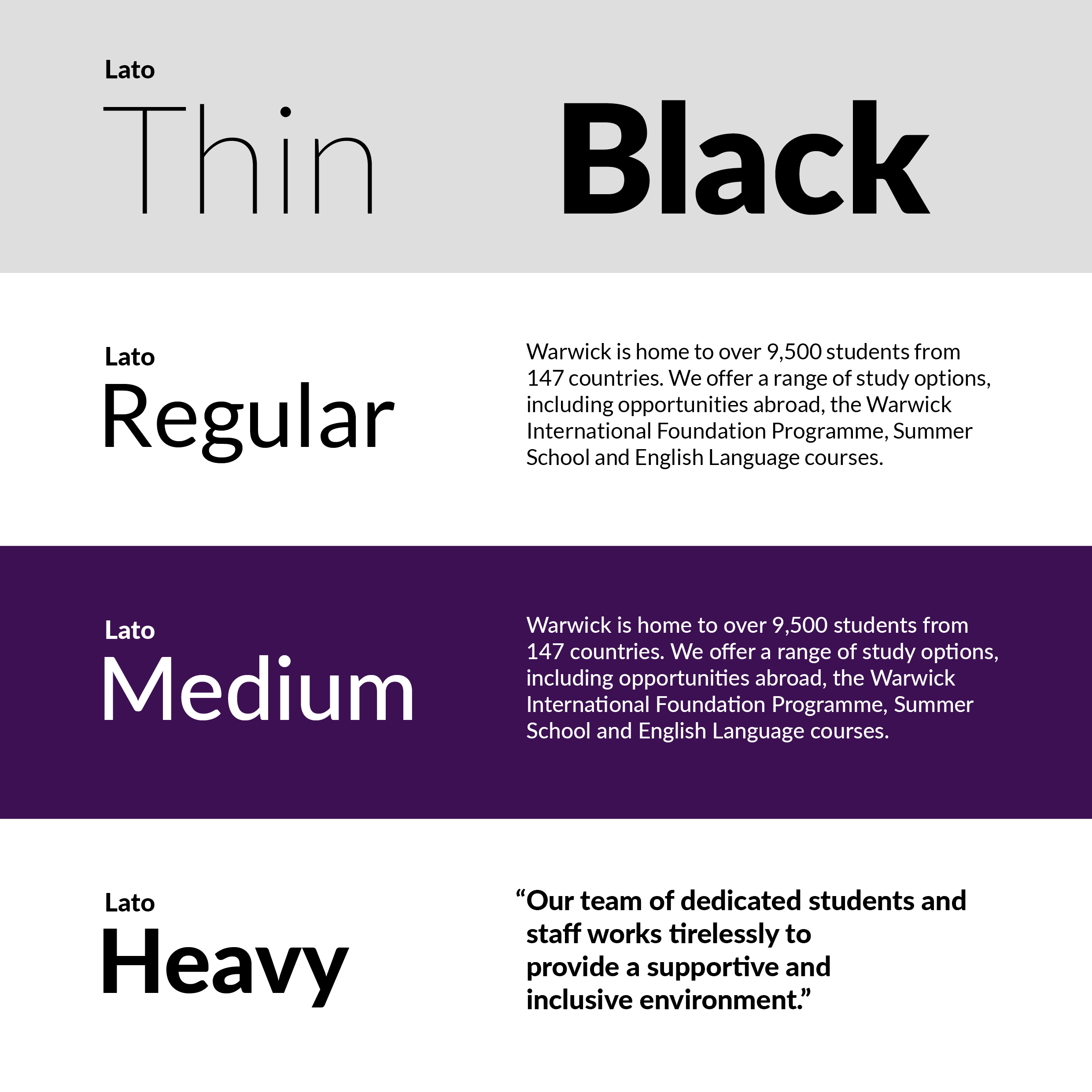
Website only - Lato
Lato is our font for all online text. Its legibility is ideal to be read on screen.
Light should be used for larger key messaging as it can become less legible at smaller sizes.
Regular should be used for all body text.
Medium is preferred on a dark background to provide strong legibility.
Heavy should be used in pull-out quotes, headers and subheads.
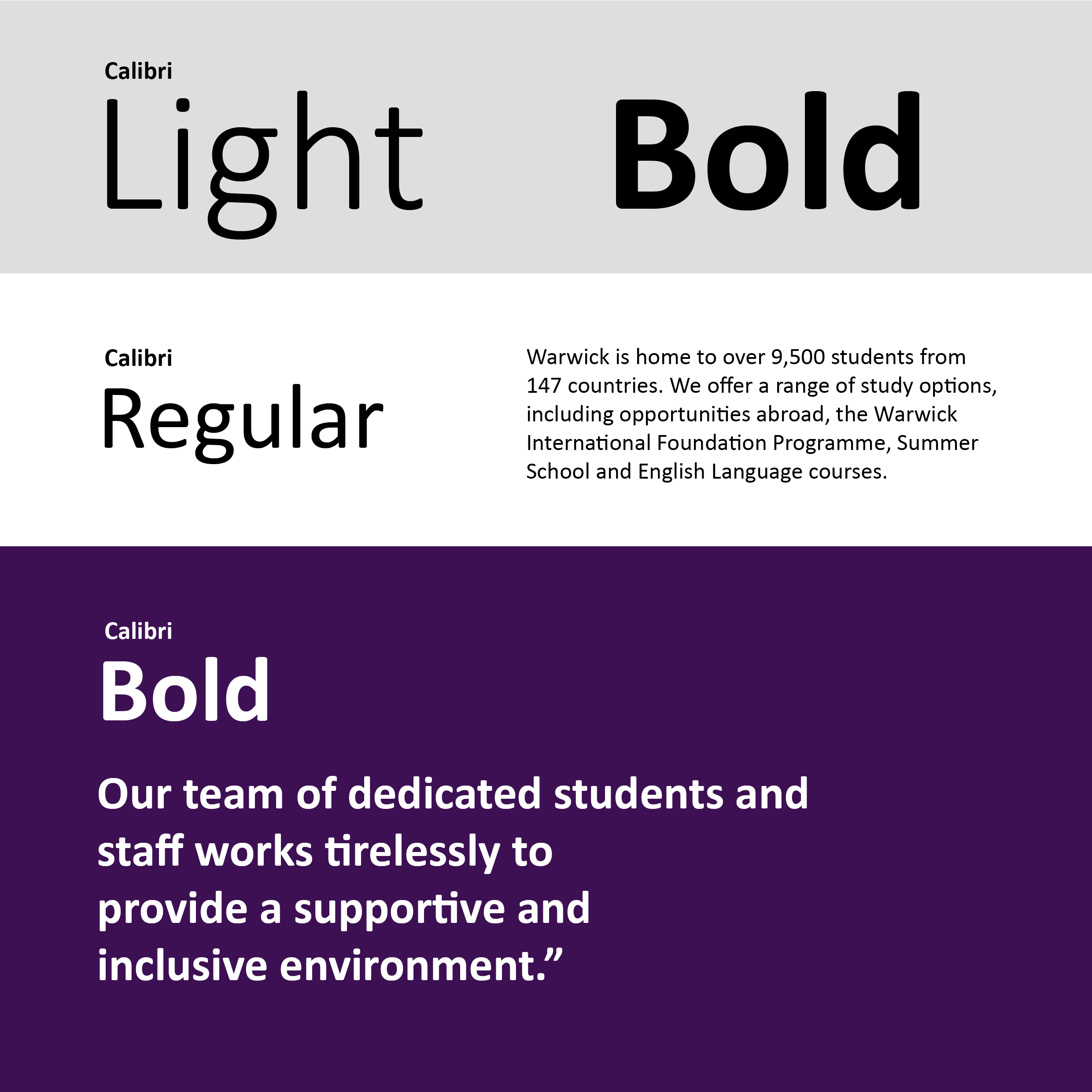
Microsoft Office - Calibri
Calibri is our font for all Office applications such as Word and PowerPoint, and for email.
Light should be used for larger key messaging (24pt and above) as it can become less legible at smaller sizes.
Regular should be used for all body text.
Bold should be used in pull-out quotes, headers and subheads.
Brand Guidelines
| > Colours | > Logos | > Brand codes | > Imagery |