
Videography
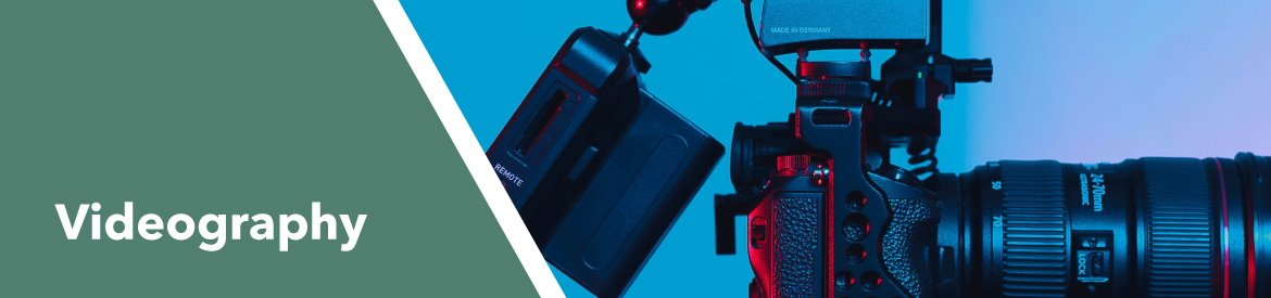
Videography guidelines
We need to keep our brand identity consistent as it extends across all outputs, with video being an important and increasingly prominent channel.
To help you create quality videos in line with our brand, please make sure that every piece of video content you create begins and ends with one of the branded idents below.
Video mood & tone
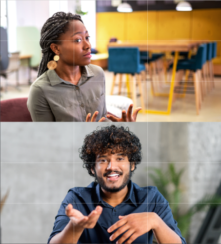
Our video style is an extension of our photography style, reflecting our people and the impact of our work in a warm and authentic way.
Using a shallow depth of field helps bring subjects into focus and adds a more intimate feel. A subtle handheld technique can be used to make footage feel grounded and real. Slow motion is a preferred technique for supplemental scene-setting footage, such as establishing the location.
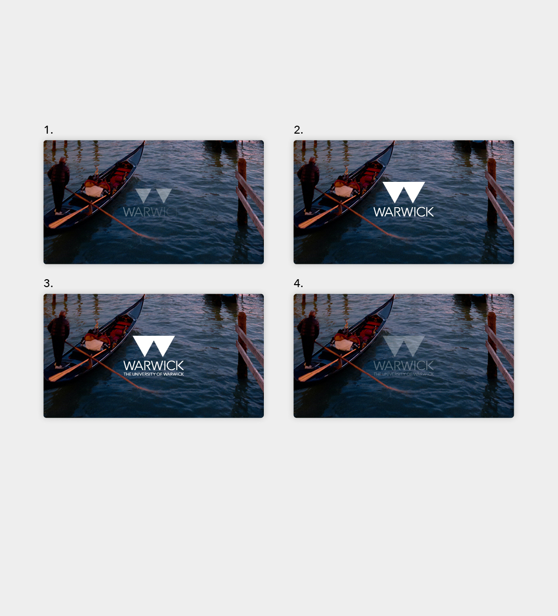
Video idents
Our brand identity should extend across all outputs, with video being an important and increasingly prominent channel. Every piece of video content should either begin or end with our branded ident* . The ident can also be used at both the beginning and end of videos (where deemed appropriate), particularly when creating longer form video content which is 2 minutes or longer. The supplied animation file should be used at all times.
Primary video ident
Secondary video ident
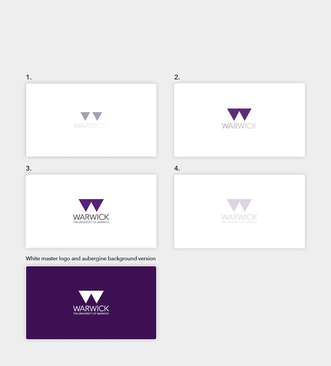
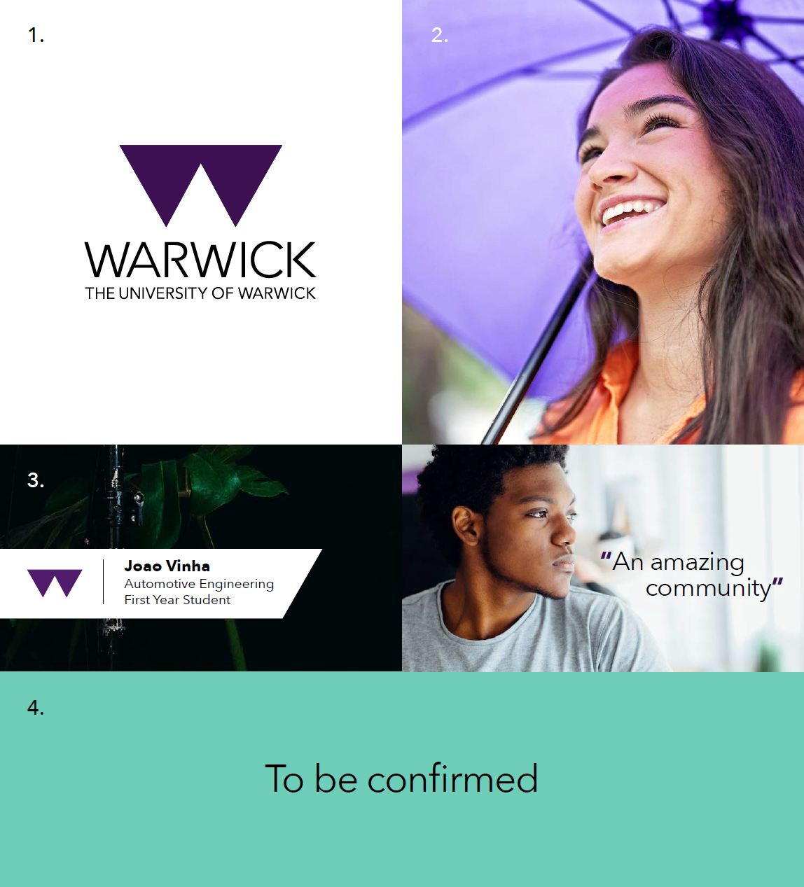
This is our primary version which should be used wherever possible. The screen is all white. The Warwick wordmark fades in as the two halves of the ‘W’ shape grow and fade from below (1), forming the completed shape in full colour (2). The descriptor line animates in below the wordmark (3), completing the master logo.
After sitting on screen for two seconds, the master logo fades to white (4), before transitioning into the start of the video content.
A second option of the primary ident uses the white version of the master logo with an aubergine background.
All of the above attributes apply in exactly the same way when opting for the white master logo on an aubergine background.
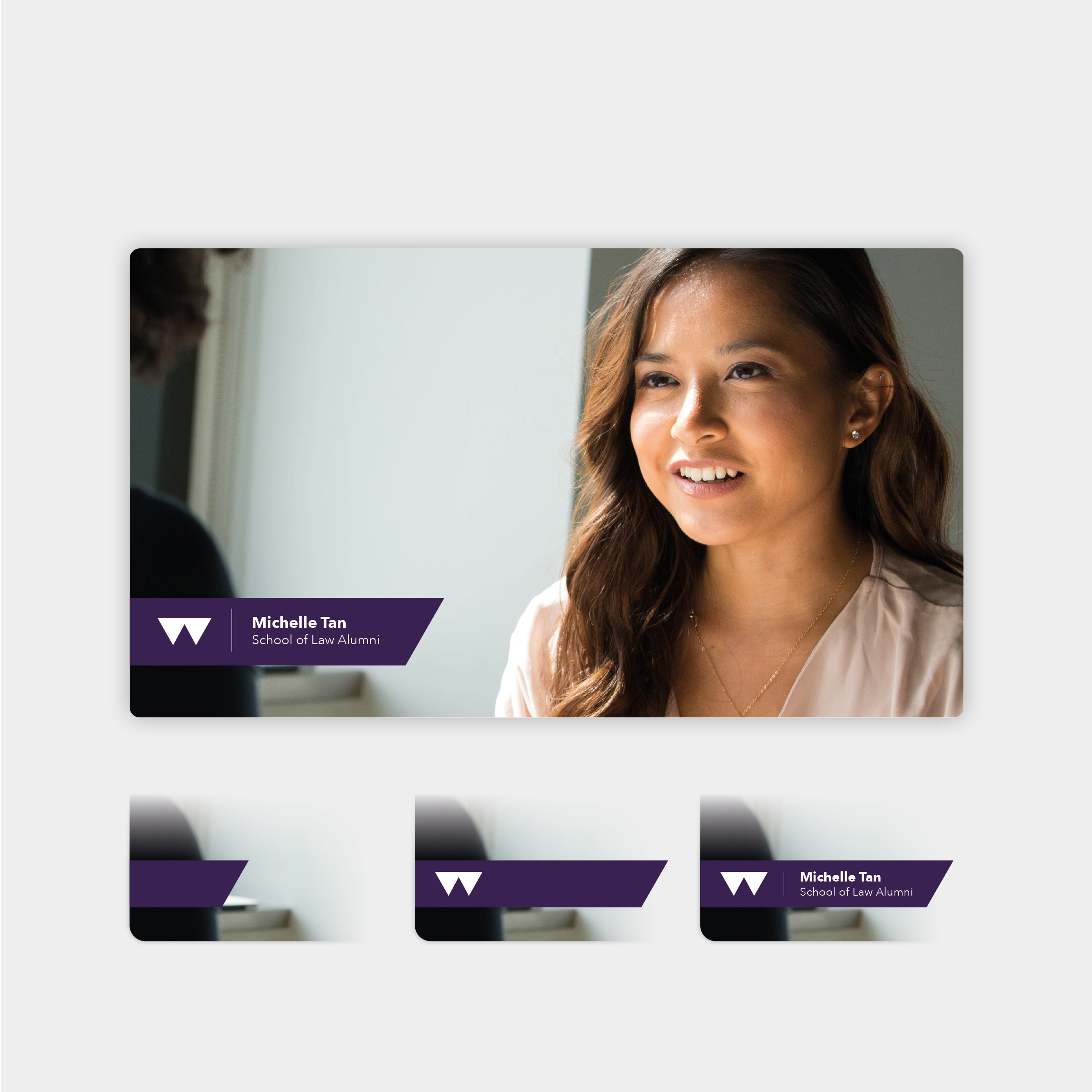
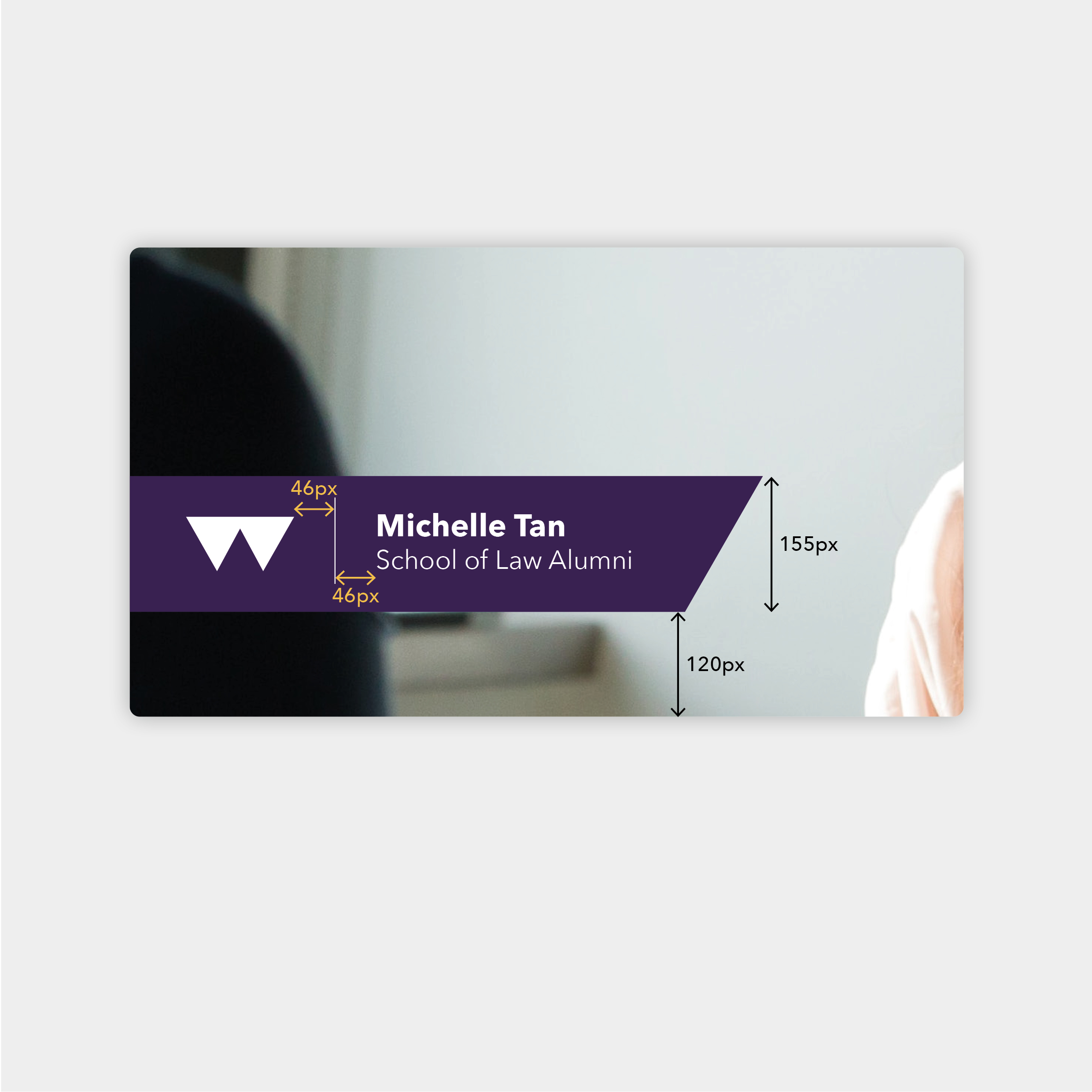
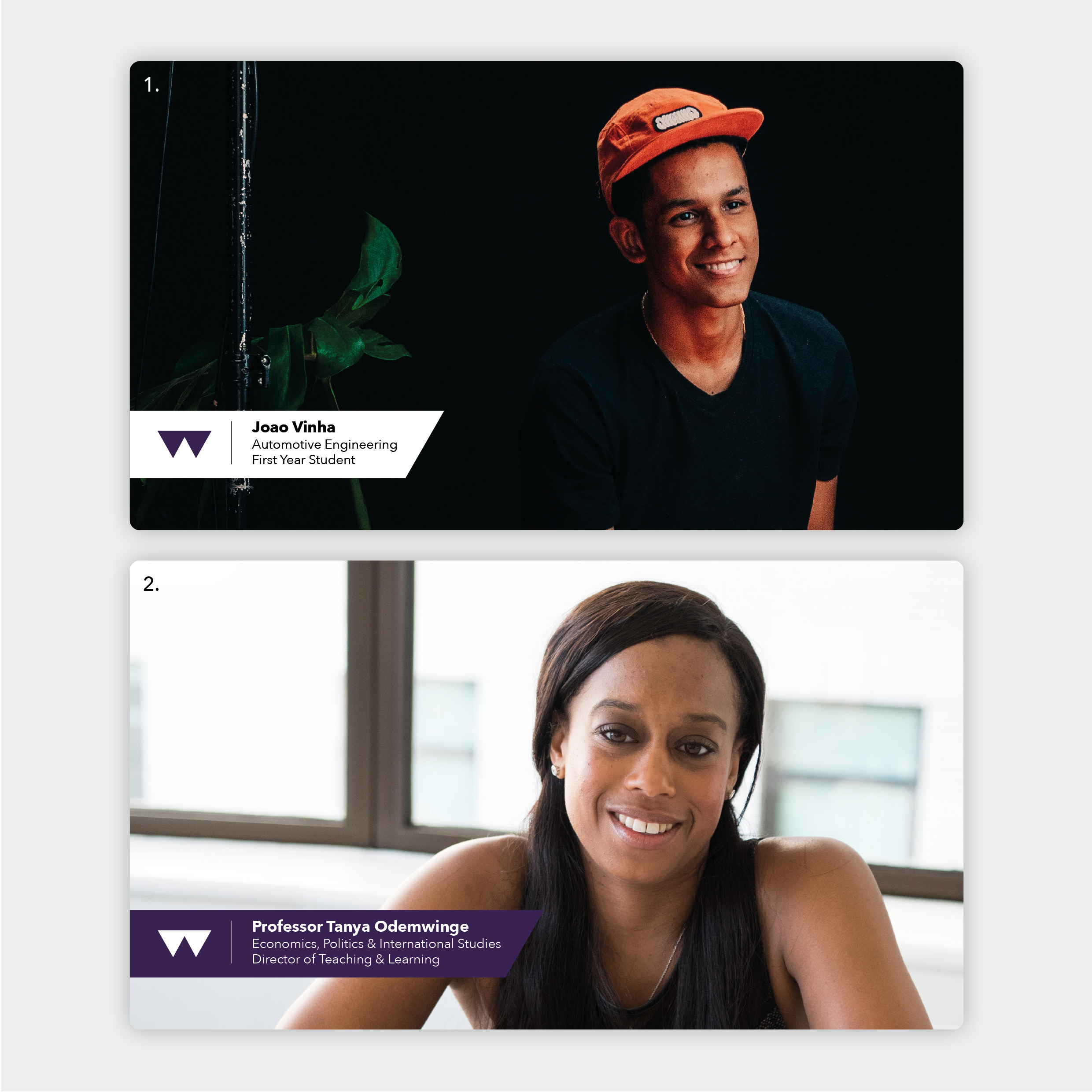
Videography lower third
Our lower third is a branded way of displaying information on screen, particularly people’s names and titles.
It consists of an aubergine panel that is anchored to the left of the screen, our monogram to the left of a dividing line, with the name and title to the right. The angle on the end of the panel mirrors that of the monogram.
Please contact the brand team via if you need more information on the lower third.
Please visit the brand resources page for access to our videography lower thirds and video idents. You will be required to sign in to access these files.
Other videography techniques
In the tabs below you'll find information on using colour correction, subtitles and talking heads. Please click on the images to enlarge.
Colour correction
Colour correction and grading is vital in creating authenticity and warmth. It should only be implemented by a professional.
Final videos should be graded to natural colours where appropriate to best capture real moments and natural skin tones.
Black and white may be used if it suits the subject and tone of the film but must be a justifiable stylistic decision.
Please do not over or under saturate footage or edit too heavily towards one colour range.
Brand codes
Video is the perfect medium for delivering our message in an emotive and engaging way. While the use of our brand codes is less strict here, there are opportunities to include some references to our visual identity.
Here are some brand codes and more subtle brand cues that can be used:
1. Our master logo ident
2. Our aubergine colour (as scenery, a prop or a graphic element)
3. Our brand typeface (for any text on screen, including lower third & subtitles)
4. Our tagline: 'To be confirmed' (as text on screen or spoken in video content)
Please click on the image on the right to enlarge.
You can find more information on planning a video or photography shoot, including obtaining consent, on our Imagery & Videography resources page.
| > Imagery guidelines | > Imagery & videography resources | > Our approved photographers | > Back to brand guidelines |