
Logos

The University of Warwick logo
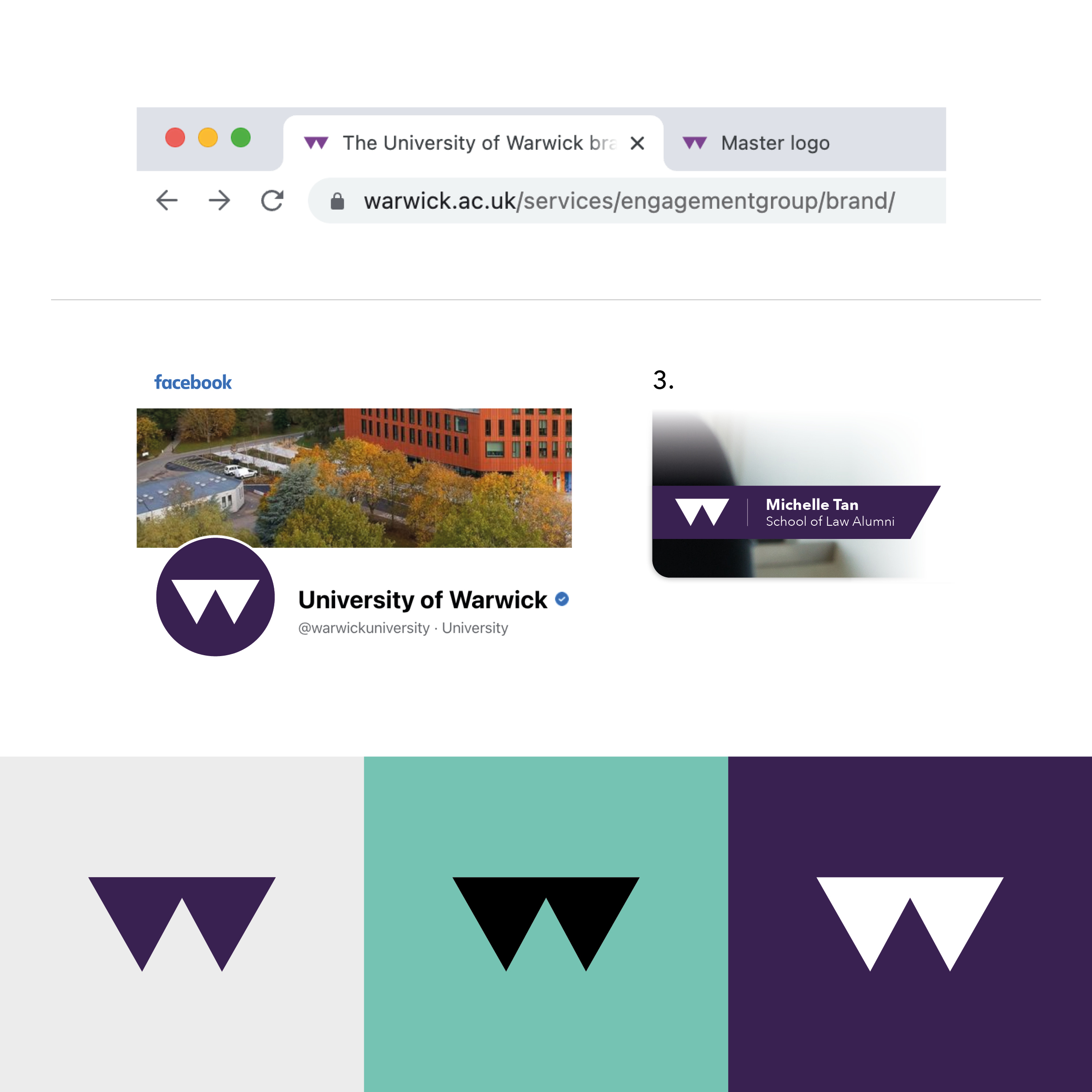
Our master logo is the singular, consistent face of our brand.
Aside from a few exceptions, we recommend that it appears on everything we produce to maintain consistency and recognition.
Alongside the master logo, departmental logos and the Crest are also used to represent ourselves in certain circumstances.
To ensure consistency and improve brand recognition across all communications, we advise that the below guidance is followed.

How to use the master logo
Below you will find further information on how to ensure you're using The University of Warwick logo correctly. Please click on the images within the tabs to enlarge.
Colourways
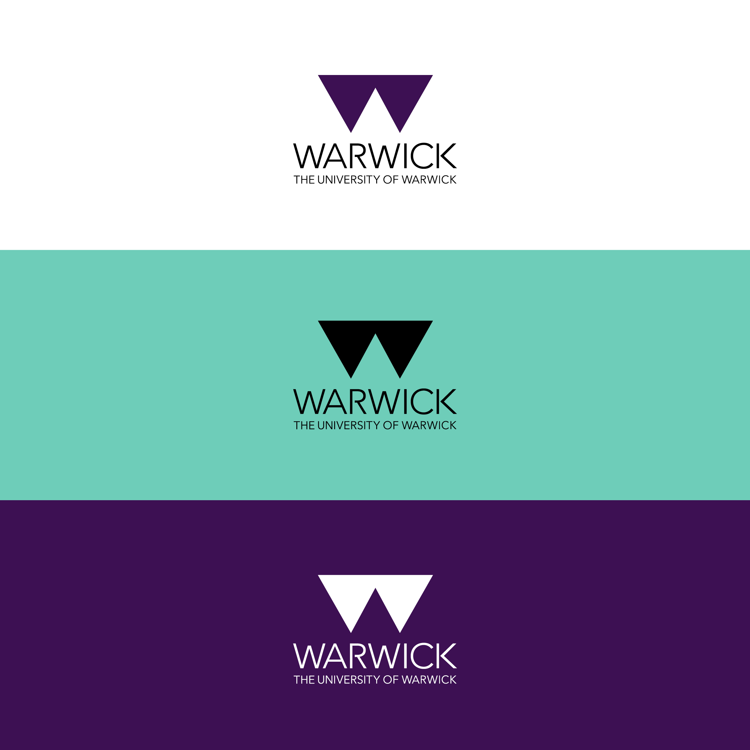
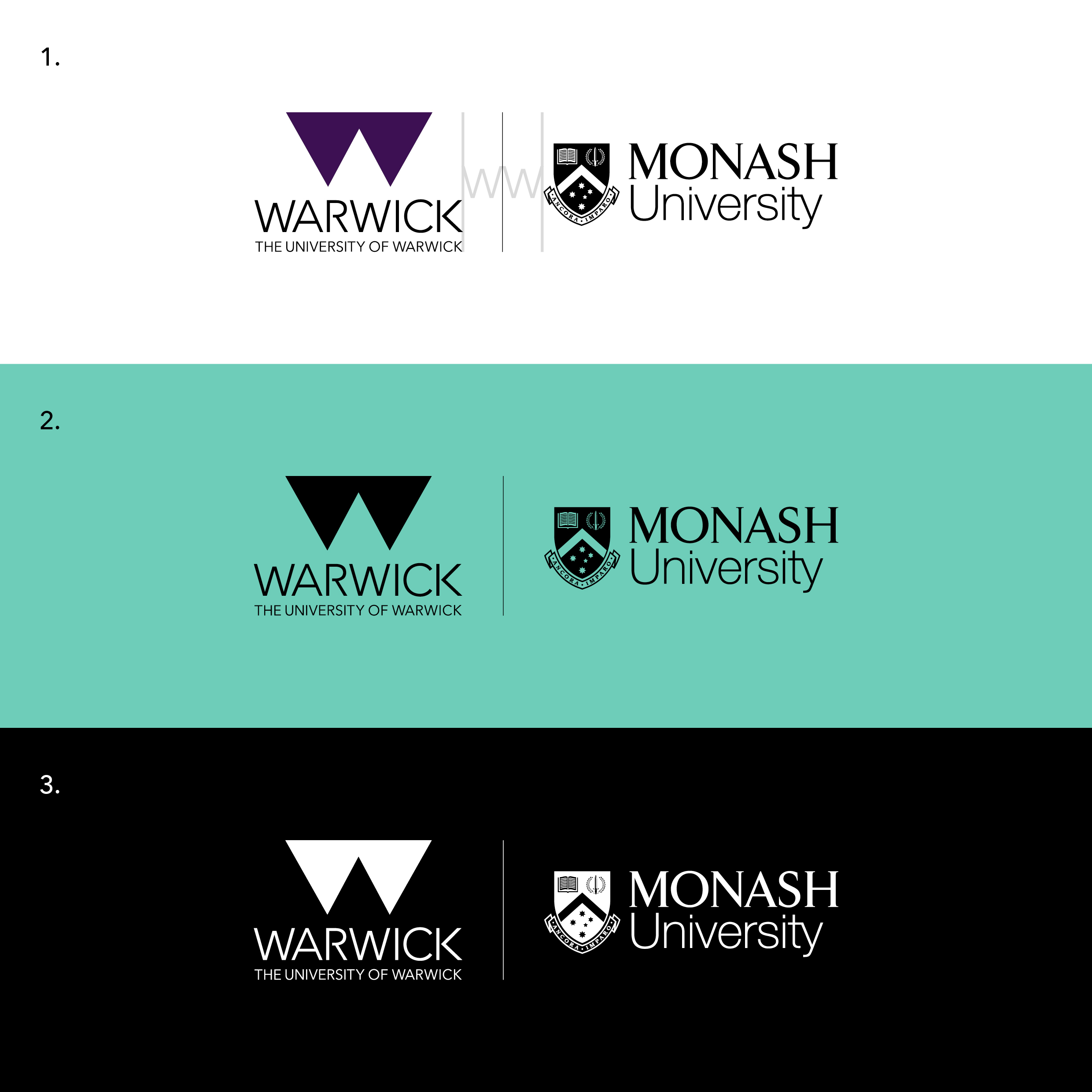
Our master logo is available in our primary colour aubergine as well as in black and white.
We advise that the white version of our logo is only used against dark backgrounds. For the black version, we advise that it be used only against light-coloured backgrounds or when the aubergine version will not reproduce well.
Please visit the brand resources page to access and download our master logo. You will be required to sign in to access these files.
The Crest
Our Crest provides a mark of quality and gives a sense of our heritage, establishment and academic rigour.
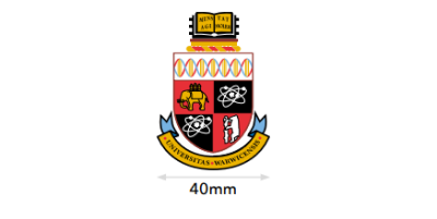
To protect the legibility of the Crest, the minimum size in which it should appear is 30mm wide.
The Crest can only be used on graduation-related materials, student theses/dissertations and high-end applications such as merchandise and gifting.
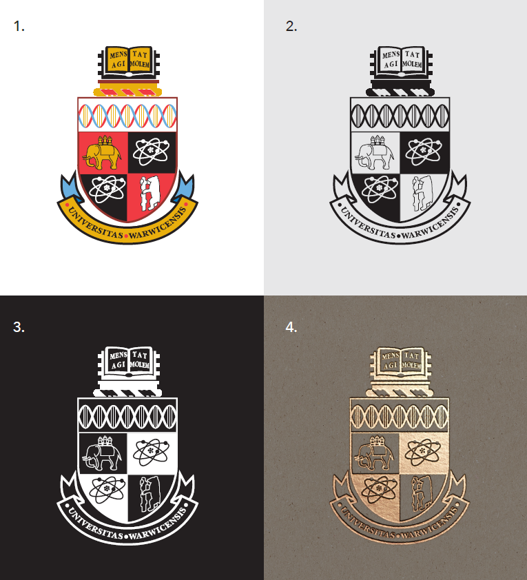
It must appear in full colour on a white background (1), in black on a light background (2) or in white on a dark background (3).
It can also be reproduced using print finishing techniques such as embossing or foiling (4).
Exclusion zone
The exclusion zone ensures the Crest has enough clear space at all times to stand out. It can be found by using the width of the elephant as a reference for the height and width of the exclusion zone surrounding the Crest (1).
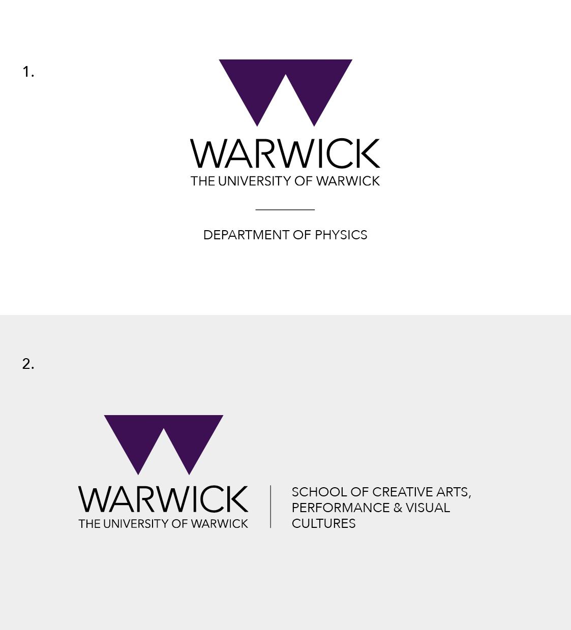
Departmental logos
Our departmental logos need to clearly signify they are part of The University of Warwick, with the department also being clearly identifiable at a glance.
We have two options dependent on usage: the stacked version (1) and the horizontal version (2). Our stacked version is the primary option, to be used where possible.
We recommend these standardised naming conventions for departments to use in order to create consistency where possible, of which there are four options:
- School of…
- Department of…
- Centre for…
- Institute of…
All new departmental logos must be created and supplied via the Brand Team to ensure a consistent format.
For more information on departmental logos, please refer to our brand guidelines at first instance.
FAQs
If you have any questions, or if you can't find the logo you're looking for, please visit our FAQs page for further information.