Accessibility: A practical guide for teachers
This information gives a brief overview of accessibility and its practical implications for your activities as teachers. It is based on the Equality Act (2010)Link opens in a new window. It does not constitute legal advice and is only intended to provide guidance and information. Whilst every effort has been made to ensure that the information given here is correct, we cannot accept any liability regarding the accuracy or completeness of the information, or its application under the Equality Act (2010).
NB: If you have learners with declared visual impairments, dyslexia or other learning difficulties, the best advice is to talk to them to understand what adjustments they need. Do not assume that all learners who suffer with dyslexia (for example) will require the same adjustment(s). What works for one learner may work for others but this is not always the case; if in doubt ask.
Any questions relating to accessibility and teaching at Warwick University should be emailed to webaccessibility@warwick.ac.uk.Link opens in a new window
Any questions relating to accessibility and teaching at your placement institution(s), should be directed to your mentor in the first instance and they should be able to help direct your query appropriately.
If you would like to know more about inclusive practice and creating inclusive resources* please see these links:
- Inclusive practice and UDL
- Creating inclusive mathematical content
- Creating inclusive Moodle spaces
- Creating inclusive PDF documents
- Creating inclusive PowerPoint presentations
- Creating inclusive Word documents
* Please be aware that these resources will change over time as legislation and available technology are adapted/updated.
Content development and delivery
In order to try to simplify things, this section has been broken down into types of resources and the issues you need to consider when using/creating them. Please be aware however, that for content that comprises mixed components (e.g. images and text), you will need to consider all aspects of the resource to make it as accessible as possible.
Visual content
If you use images, SmartArt graphics, shapes, groups, charts, embedded objects or ink you must provide an alternative text description (or alt text) for them. This is not just for learners with declared visual impairments, dyslexia or other learning difficulties, it is good practice for all learners. The sections below refer to images but the guidance is applicable to all visual content types.
Writing alternative text descriptions - dos and don'ts
- Do use proper sentences rather than keywords or phrases. The alternative text description should make sense and should be conversational in nature.
- Do describe what is relevant for the context of the image and the purpose it serves. If you can't do this then do you really need to use the image?
- Do include emotion and humour if it helps to explain the context of the image and its purpose.
- Don't write 'this is an image of...' in the image alt text field. Screen readers will already know this and it just wastes space and effort.
- Don't write more than one or two sentences. If you need more than this, write a brief summary in the image alt text field and indicate that the learner can access a more rich description in a specific location (such as in a paragraph below the image) (Tiny Technologies, 2021).
The type of image that you use will also have an impact on the type of description you provide and these are summarised below.
Informative images
The text alternative for informative images (those which demonstrate concepts or models) should provide a brief summary of the image and the concept it illustrates. In the example below of Kolb's Learning Cycle, the alternative text description is 'Illustration of Kolb's learning cycle showing the stages of reflection. See the text below the image for further details.' This is perfectly acceptable as there is too much information to add to the image alt text field, you just need to ensure that you do add a further explanation below the image!
Kolb's Learning Cycle
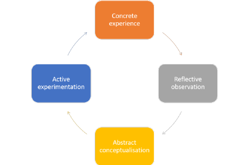
Further description: This model shows the cyclical nature of Kolb's reflective learning cycle. At the top of the circle is the Concrete experience stage, moving in a clockwise direction we then reach the Reflective observation stage, then the Abstract conceptualisation stage and finally the Active experimentation. Each stage is represented by a different coloured oblong.
Complex images
Complex images such as graphs or infographics need to have alternative text descriptions that convey the same information as the graph or infographic. It is not acceptable to simply give the title. In the case of graphs you need to describe the axes, the highest and lowest values, how the graph is shaped between these two values and any trends that are worthy of discussion. Comprehensive information about providing alternatives for mathematical content is available on the creating inclusive mathematical content page. In the case of infographics you should provide a transcript or full-text version of whatever the image displays. The link below from the Universal Design Center, gives further information about providing transcripts for infographics:
https://www.csun.edu/universal-design-center/accessible-infographicsLink opens in a new window
Decorative images
If you are using images purely for decorative purposes then you do not need to provide an alternative text description but you should try to provide a null text alternative (alt="") instead. Websites will generally give you a field to add this to but other types of software may vary. It is worth checking whether you really need to include decorative images within your work. Do they really add value to the learner? If in doubt leave them out.
Images as links
Images that are used as a link to another source or website should describe the functionality of the link rather than the image itself. So for example, if you have an image of a book that you are using as a link to the library website, you need to tell learners that by clicking on the image they will be taken to the library website.
Images of text
You should avoid using images of text if you can but if you have to use them, then the alternative text description should contain exactly the same text as the image.
Collages
Alternative text descriptions of collages need to convey the general theme of the collage, they do not need to describe each individual image (unless you really want to provide this).
Hotspots
The text alternative for an image that contains multiple clickable areas (hotspots) should provide an overall context for the set of links. Also, each individually clickable area should have alternative text that describes the purpose or destination of the link.
This decision treeLink opens in a new window resource produced by the Web Accessibility Initiative is a useful resource for helping you to decide what type of image you have and the type of description you need to provide.
Text-based resources
When creating text-based resources you should ensure that your content is universally accessible i.e. that it can be read and understood by as many learners as possible. It is good practice to assume that your resource will be accessed by learners with visual impairments, dyslexia or other learning difficulties and therefore needs to be comprehensible once it has been passed through a screen reader. One suggestion at this point is to try passing a document that you normally use in your teaching through a screen reader to see what it does to it. The link below from Usability Geek give some examples of freely available screen reader software that you can use for this purpose:
AbilityNet is a UK charity that provides support for individuals living with disability or impairment on how they can use technology (AbilityNet, 2021). They have established several key principles that you should consider when creating universally accessible text-based documents:
- Use proper headings - heading one, heading two etc., do not use bold or underlined text as headings and try to be logical with your use of headings (main section headings should be styled with heading one, sub-section headings should be styled with heading two etc.).
- Write in short, simple sentences - if your sentences are more than about 20 words long, they are too long and you should revise your text.
- Write in plain language and avoid jargon and abbreviations - if you need to use acronyms or specialist language think about having a glossary section to explain the terms you are using.
- Use a common, plain font (san serif) and a text size of at least 12 point - black text on a white or cream background is best although some learners with visual impairments may find white text on a dark background easier to read (again ask rather than making assumptions about this one).
- Use proper list formatting for numbered or bulleted lists - screen readers will then recognise that the text is part of a list and treat it as such.
- Provide a meaningful description of important images - the key word here is meaningful. If your image is a graph you will need to provide a comprehensive description of it, so that someone who cannot see it can still understand what it is illustrating (be aware that this is not as simple as it sounds!)
The full version of this guidance is available from the link below:
https://abilitynet.org.uk/factsheets/creating-accessible-documents-0Link opens in a new window
Video and audio resources
Whilst most of the accessibility guidance on this page constitutes best practice rather than statutory requirement, the rules about providing accessible video and audio resources are now a legal requirement and are based upon the Web Content Accessibility GuidelinesLink opens in a new window (WCAG) standard.
Any pre-recorded audio and video content created before 23 September 2020 is exempt from the accessibility regulations listed below. Live audio and video are still exempt from the regulations BUT if a live event is recorded and then shared later as a video or audio resource (e.g. via Blackboard Collaborate or Microsoft Teams), it is considered a pre-recorded video and is no longer exempt from the regulations.
Any pre-recorded video (that is not in itself an alternative to text) recorded after 23rd September 2020 must have an alternative that presents equivalent information. Acceptable alternatives include a PowerPoint presentation with teacher notes, a text summary or a transcript. A transcript is a document that includes correctly sequenced text descriptions of time-based visual and auditory information. A video script or transcript generated by Echo360 or Microsoft Teams meets this definition (although caveats about the accuracy of these automatically generated transcripts should be provided).
Whilst captions (subtitles) are not a legal requirement, if you have the time to do this then you should endeavour to provide them. Captions are synchronised visual and/or text alternatives for both speech and non-speech audio information needed to understand the media content. Again captions can be generated by Echo360 or Microsoft Teams.
Guidance for creating text alternatives for video and audio resources
NB: The standards also mention audio description. Audio description is narration added to the soundtrack to describe important visual details that cannot be understood within the main soundtrack alone. Audio description of video provides information about actions, characters, scene changes, on-screen text, and other visual content. Audio description is not necessary when all of the video information is already provided in the existing audio.
In the context of materials in our taught programmes and modules at Warwick, we have determined that it will not be possible to include audio description on all teaching and learning content except where a learner has a reasonable adjustment requirement. So if a learner with a declared accessibility need asks you for an audio description, you will need to provide one, but otherwise you do not.
The Bureau of Internet Accessibility (2019) provides the following comprehensive guidance on creating accessible videos:
https://www.boia.org/blog/checklist-for-creating-accessible-videosLink opens in a new window
The key principles that you should consider when creating universally accessible video and audio content are:
- Use modern video or audio formats (e.g. mp4 for video files and mp3 for audio files) that will play with an accessible media player (e.g. HTML5 players). You should not use Flash to create videos as its support has been withdrawn.
- Always provide a text alternative (e.g. a transcript) or captions for your video or audio file (unless it is already a text alternative).
- Use colours carefully and always choose colours with good contrast (this further practical guidance on using appropriate colours from the Web Accessibility Initiative is helpful)Link opens in a new window.
- Ensure any text on the video is of an appropriate size and font (use the guidance from the text-based resources section for this).
- Avoid using content that flashes as it is distracting and can induce seizures in learners with certain conditions.
Generating transcripts/captions
Please be aware that there is no one recommended solution for generating transcripts or captions for online content. Some software provides transcripts and/or captions automatically, but the accuracy of that output can vary considerably. Collated information about a number of software options is available here:
Websites and web pages
The link to the checklist below gives straightforward advice on the main accessibility issues you should address when designing websites and web pages. It gives details of some free tools you can use to check your site or page and techniques you can use to improve the accessibility of the content they display.
The Home Office has produced a set of posters on designing for accessibility. They are designed for quick reference rather than detail and cover a range of specific disabilities and/or impairments. There is a text version of each poster listed below each image.
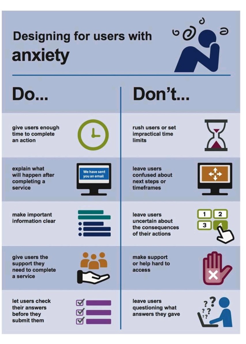
Anxiety (word version)Link opens in a new window
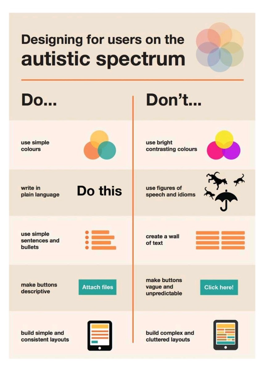
Autistic spectrum (Word version)Link opens in a new window
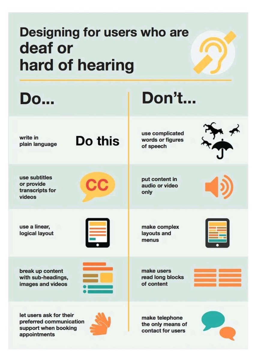
Deaf (Word version)Link opens in a new window
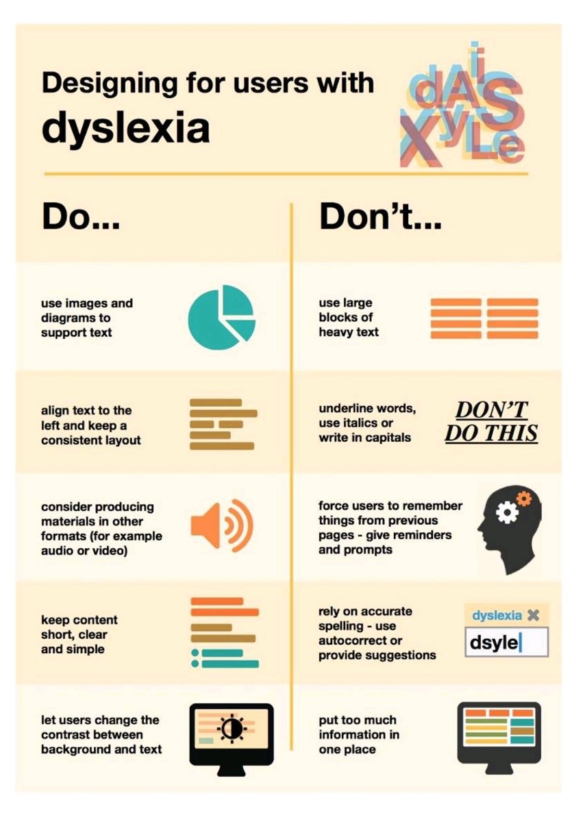
Dyslexia (Word version)Link opens in a new window
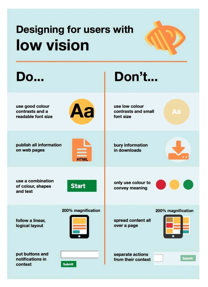
Low vision (Word version)Link opens in a new window
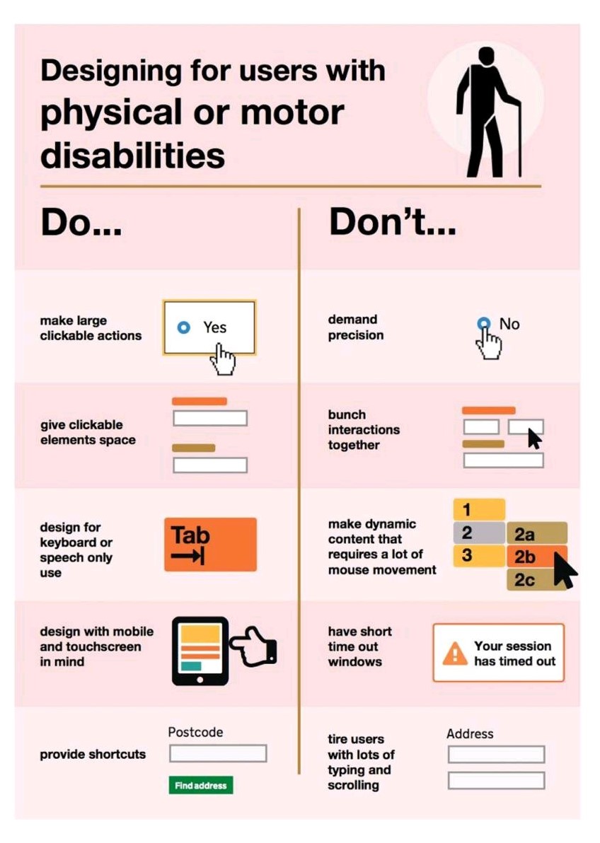
Physical or motor disabilities (Word version)Link opens in a new window
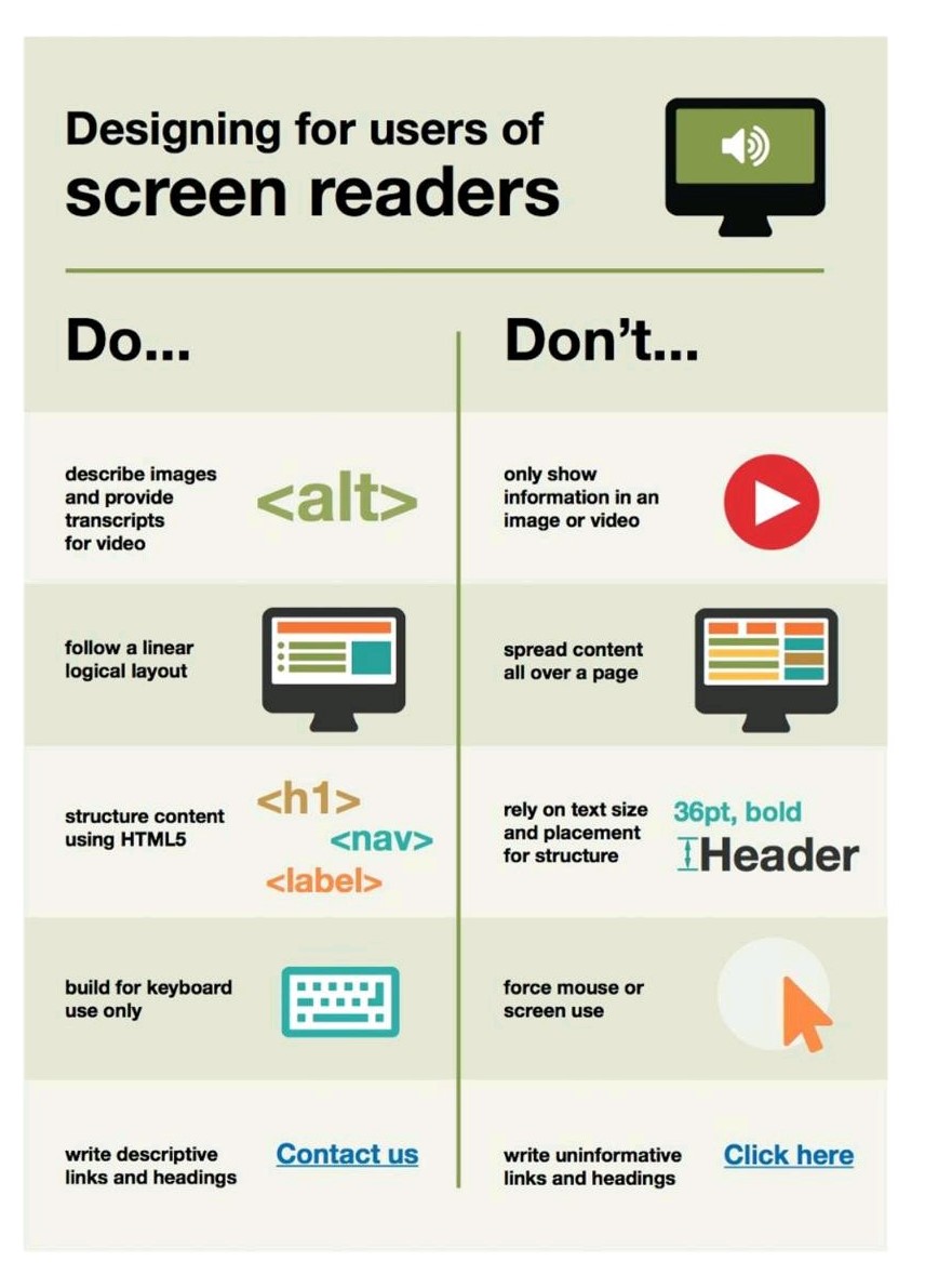
Screen reader (Word version)Link opens in a new window
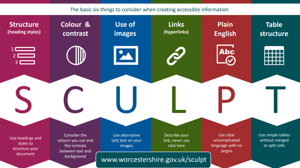
Worcestershire County Council have also developed a minimum set of standards for accessibility and inclusive practice which they have named SCULPT. An image of the acronym is shown below and further information about what each letter stands for is displayed below the image.