
Posters for a public audience
Do you want to make an engaging poster for a public audience? Then this guide is for you.
Introduction
Video transcript
Hi everyone, I’m Hana Ayoob. I’m an illustrator and science communicator with a decade of experience in a range of science engagement settings from supporting patients on a clinical trial to producing science festivals.
In this guide I’m going to walk you through all the things you need to consider when making a poster for a lay audience. We’ll think about what you want your poster to achieve and who you’re trying to reach, before moving on to planning and then making your poster.
Why do you want to make a poster?
Grab yourself a pen and paper, or open up a document and work through the questions below. I urge you to take the time to write down an answer to every single question.
- Who do you want to reach with your poster? Try to be as specific as possible - e.g. children in upper primary, adults with asthma or people attending a certain event. For guidance on defining your audience, visit this pageLink opens in a new window in the Skills Festival.
- Why do you want to reach them?
- What do you want your audience to gain or do after seeing your poster?
- Do you want to tell them something? If so, what?
- Do you want them to seek more information? Why? How will they seek it?
- Do you want them to contact you? Why? How?
- Where does your poster need to go to reach your audience?
- Will they see the poster at an event where they can speak to you? Or will they see it in isolation?
Refer back to these answers as you work through the rest of the guide. I would suggest reading through the whole of the guide before you make any final decisions about your poster. Feel free to sketch out ideas and make notes of your ideas as you go!
To enlarge any image on this page, click on it. All of the images have alternative text descriptions too.
Planning your poster
Anatomy of a poster
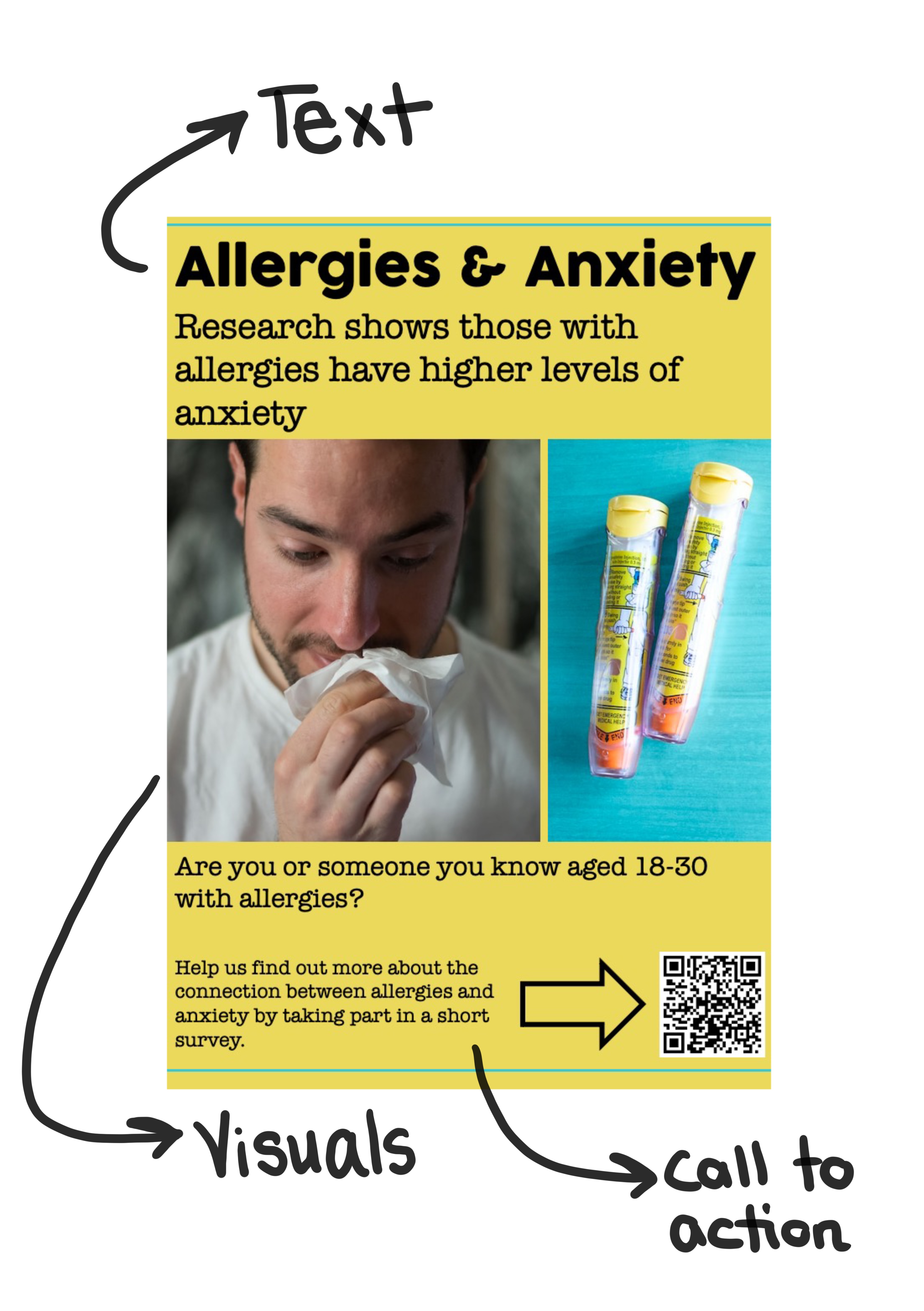
A poster has a few core elements (see example):
- Text: Usually in different sizes and split into easily readable chunks
- Visual elements: These include decorative elements, diagrams and other images
- Call to action: This could be text, a visual element or both which clearly indicates what your audience should do next
Drafting your text
Here are some things to keep in mind when drafting your text. Remember to keep your answers to the questions in the introduction in mind as you do this.
- Keep the amount of text on your poster to a minimum. The less text you include, the more likely it is that someone will read it! Think carefully about what you choose to include. Try to put yourself into your audience’s shoes - how likely are you to read large blocks of text when you’re not in a work or education setting?
- If your audience is going to come across the poster at an event where you are also there e.g. on an interactive stall, remember that they can’t read text and speak to you at the same time. Ideally the poster should contain just enough information to get them interested in the stall or include details on where they can find more information. Think carefully about what the poster is for in these situations.
- Limit your use of jargon and technical words, and think carefully about what your target audience will already know about your subject. This text editor is a fun way of seeing if the words you are using are in the top 1000 most used words. There are a lot of other readability testing apps online including this one which looks at both meaning and structure.
- Use a ‘hierarchy of text’ - this is a way to guide the reader from the most important, attention-grabbing information on your poster through to the details. Think about when you read an article online or in print, and how your attention is usually drawn to the headline first before any smaller text.
-
Your heading should contain the most important information. It should be visually striking - larger, bolder, maybe in a different colour to the rest of your text.
-
Your subheading contains the next most important information before moving on to the main body of the text.
-
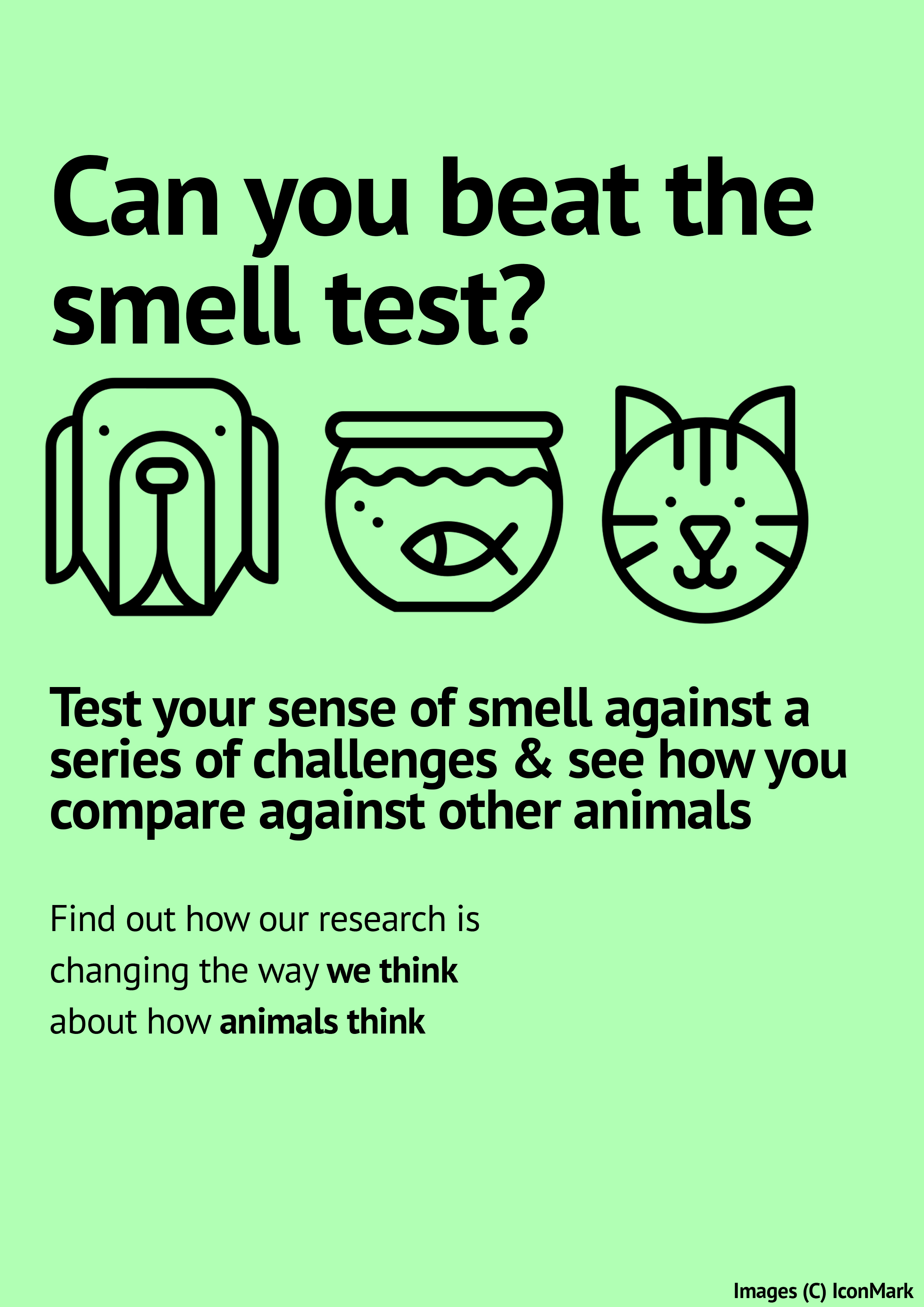
In what order do you naturally read the text on the 'smell test' poster here? Do you think it is the most useful or engaging order? If not, how could the poster be improved?
- Keep your text simple - limit yourself to two or three fonts and a handful of colours.
- Keep the layout of your text simple - this will be easier if you have less text to start with.
Using images
- Images can:
-
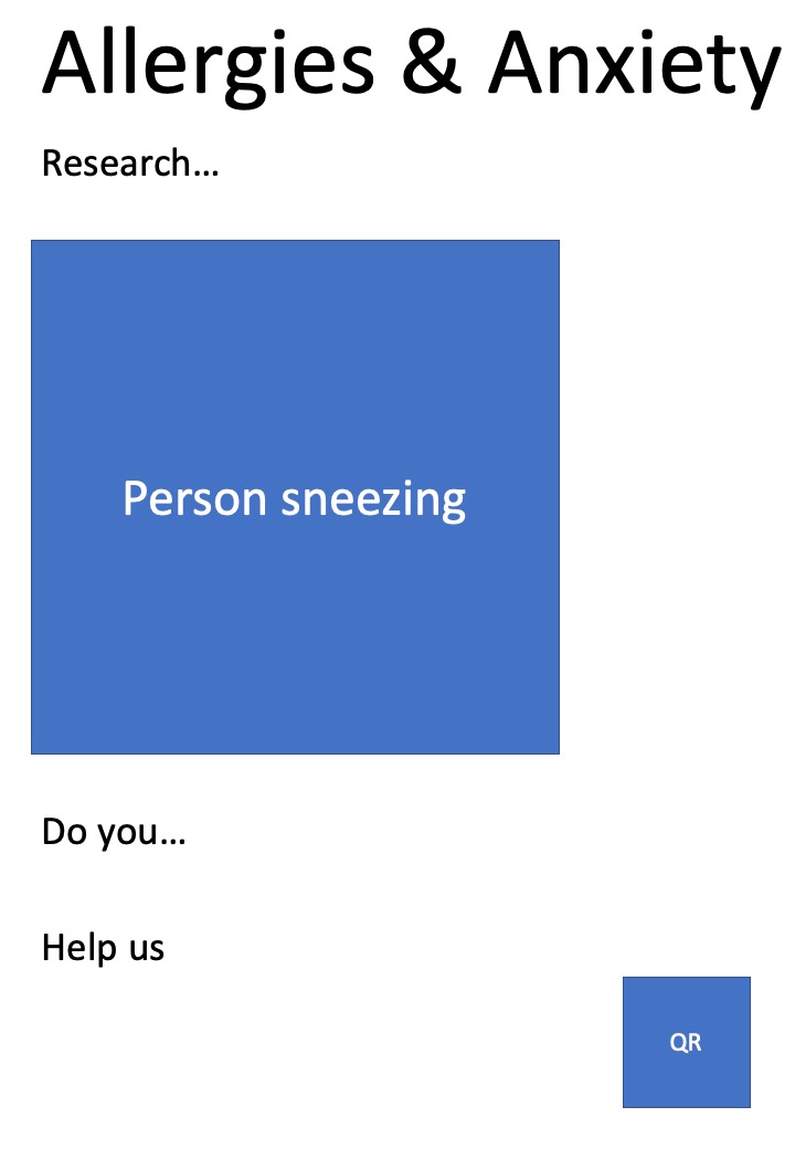
Grab your audience’s attention e.g. The sneezing person in the allergy poster or the animals on the smell test poster below.
-
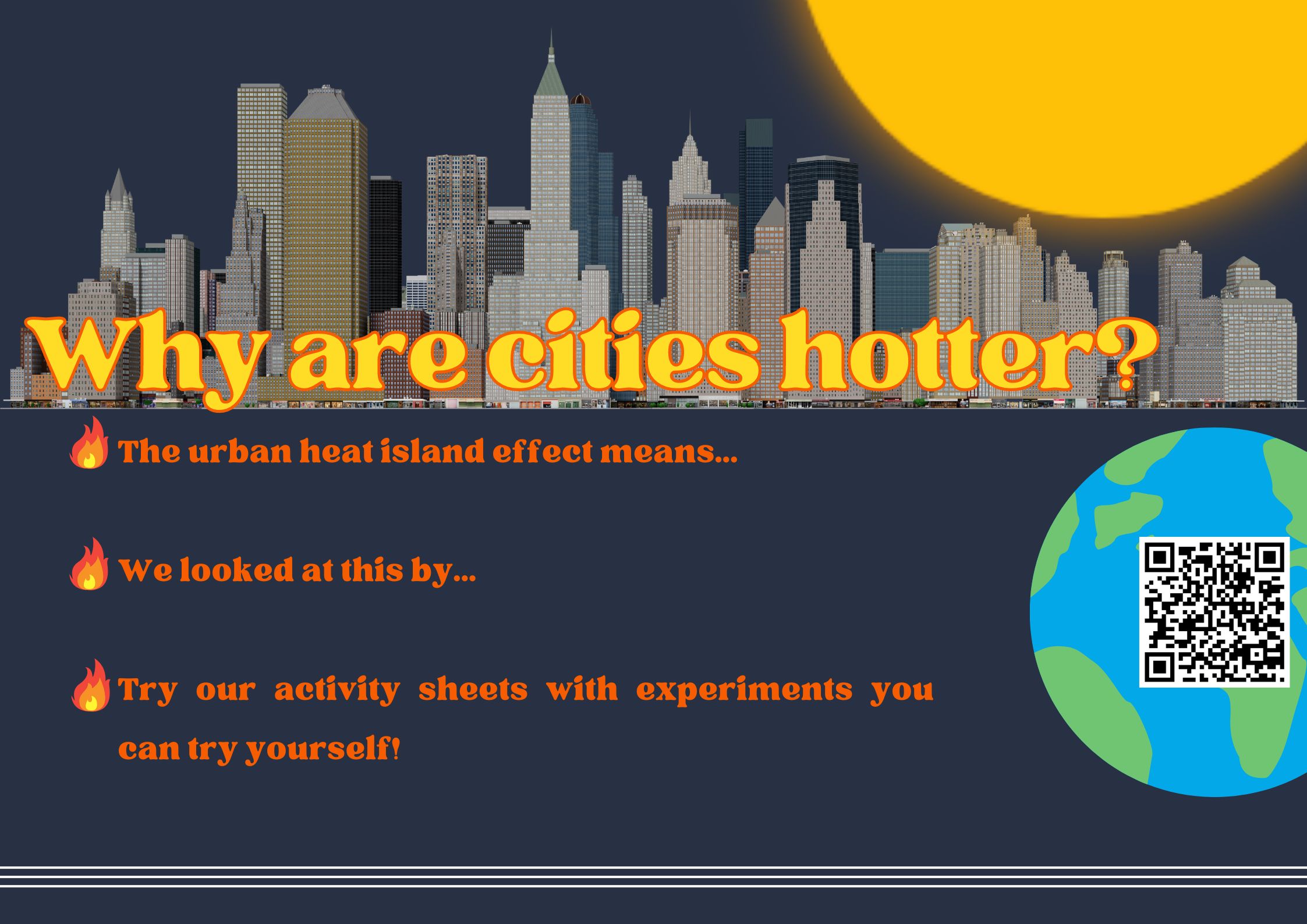
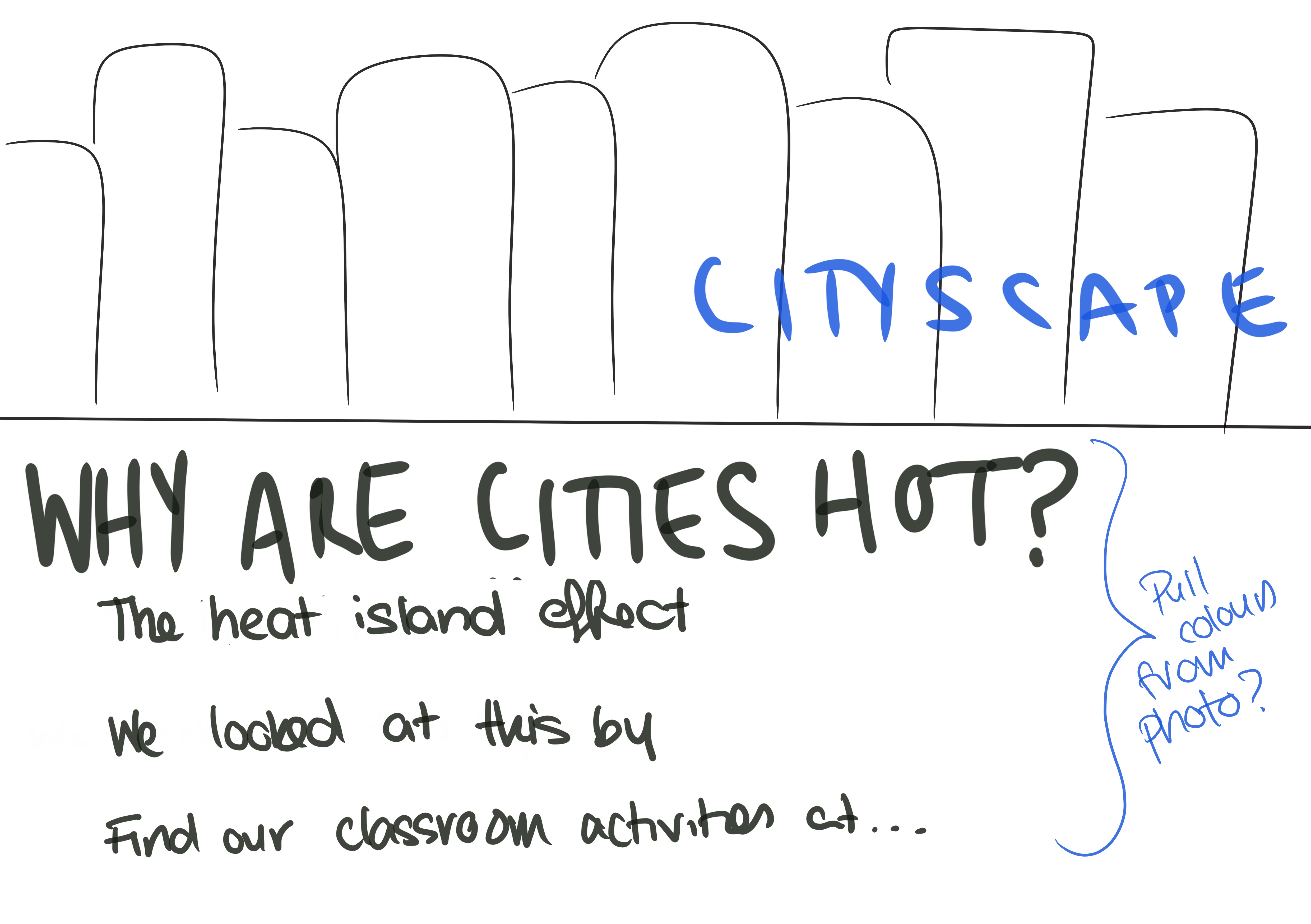
Provide information on its own e.g. a simple graph could be added to the hot cities poster below.
-
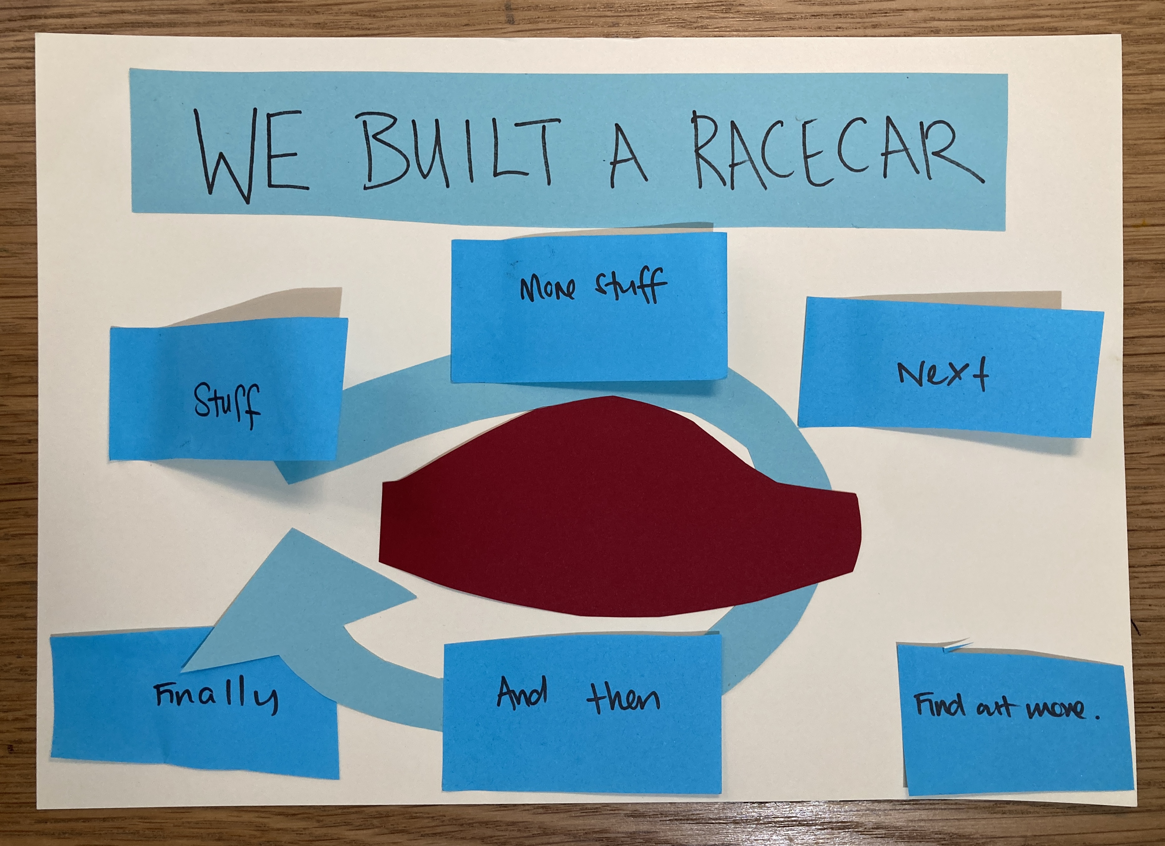
Clarify information in the text e.g. imagine a diagram of a racing car instead of an image on the racing car poster below.
-
Provide decoration or be aesthetically pleasing e.g. The noughts & crosses image below.
-
These aren’t mutually exclusive e.g. the noughts & crosses image below is both attention grabbing and decorative.

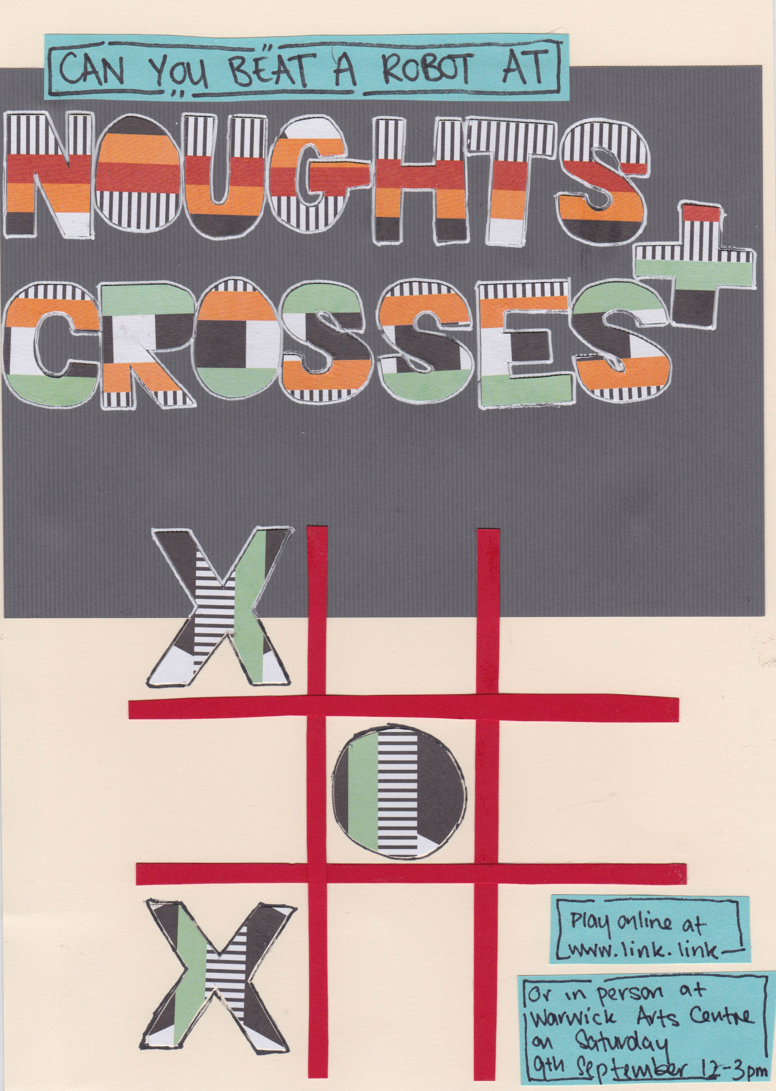

Credit Wapcaplet.
- As with your text, think carefully about what images you are including and why you are including them. Don’t clutter your poster with lots of images, it can make it less attention-grabbing and make the text harder to read.
- Think about whether the image will actually clarify a concept for someone with no/minimal background information on the subject? Is there a risk it might confuse someone further? For example a detailed anatomical diagram of the heart like the one above might confuse more than it clarifies.
A note on image permissions
If you didn’t take a photograph or create an image yourself and don’t have the permission of the creator, make sure to check whether you can use it.
Just because an image is available on the internet, this doesn’t mean that you have the right to use it in your own work. Check whether an image is in the public domain, and whether you need to provide attribution (usually some text next to the image with a name e.g. with the heart above) when you use the image.
Lots of creators use the Creative Commons system to make this clear, and you can find out more about this here.
Some good places to find images you can use:

- Wikipedia - You can either search the Wikimedia CommonsLink opens in a new window or find images from Wikipedia pages, click on individual images and check the permissions below the image (see the screenshot below).
- UnsplashLink opens in a new window - This is one of my favourite image sites. The rules for using the site are here.Link opens in a new window
- The Noun ProjectLink opens in a new window - Great site for finding icons of lots of different things. On an unpaid plan, you must provide attribution.
Call to action
This is a clear indication of what you want your audience to do next.
It could be text telling them where to find information, or with details of an event they could attend. Or you might want to include a link to an event, questionnaire or more information.
Ideally, try to use both a short link that someone could write down as well as a QR code that someone can immediately scan with their phone.
Some ways to create these:
- Some sites e.g. survey sites allow you to create your own short links & QR codes directly from them
- Google has a link shortener Link opens in a new window
- Bit.ly Link opens in a new windowallows you to create short links and QR codes
- Adobe has a free QR code generatorLink opens in a new window
Making your poster
Layout
As you’ve been considering the elements of your poster, you may have already had some ideas about how to lay everything out. Now it’s time to nail down your poster layout.
Some ways to work through your layout:
- By sketching out ideas - either on paper or on a tablet/similar (see the cities example below)
- Using cut out pieces of paper or post it notes with the different text and visual elements and moving them around until you’re happy with them (see the race car example below)
- Blocking out your layout using the software you’re planning to use to design your poster (the allergies example below used PowerPoint)
Things to consider when deciding on the layout for your poster:
- Remember that English language speakers generally look at a page from left to right and top to bottom
- If you want to change that, you need to clearly guide the eye. This could be by:
- Having a very clear text hierarchy (see above) e.g. if the heading is clearly in the middle or bottom of the page.
-
Guiding the eye using visual directions e.g. a circular arrow clearly directing the eye through a series of text blocks as in the race car poster.
-
As always, keep your page as uncluttered and simple as you can.
Tools
Focusing on who you’re trying to reach and why, and the content you need to do that is a lot more important than using tools. Use what you’re most comfortable with, and if in doubt keep it simple!
Tools you can use:
- Word and PowerPoint and their alternatives such as Apple Pages and Keynote or Google Documents and Slides shouldn’t be underestimated. You can do a lot with these familiar platforms. It can be easier to move text and images around independently on presentation programmes than on word editing programmes. The allergy poster was created with PowerPoint.
- CanvaLink opens in a new window - this a free web-based design tool with lots of tutorials. It is designed to be used with minimal design experience. It has templates for lots of things including posters, social media graphics, presentations and more. The hot cities poster was created using Canva.
- Photoshop and similar software - these are predominantly photo-editing software but are also used for graphic design projects such as posters. All can have a steep learning curve but there are lots of tutorials available online.
Adobe Photoshop Link opens in a new window- most expensive option but there are student discounts. Staff can subscribe to Adobe Creative Cloud using a university cost codeLink opens in a new window. The smell test poster was created using Photoshop.
Affinity PhotoLink opens in a new window - similar to Photoshop and is available for a one-off fee
GimpLink opens in a new window - similar free programme
- Publishing software - these programmes are specifically designed for laying out images and text for things like posters, leaflets and other publications. As above, they can have steep learning curves.
- Adobe InDesign - see note above re Abobe products. The race car poster was created using InDesign.
Affinity Publisher - see note above re Affinity products
Scribus - similar free programme
For the latest information on software available to or recommended by the University of Warwick, check this page.
You could also consider handwriting and drawing your poster either digitally on a tablet/similar or you could go analogue using paper and pens/pencils. If you do go analogue, you could also consider using other media such as collage or stamping. The noughts and crosses poster below was made by hand.
Be careful about copyright when using images in collage - in addition to the advice above about image rights, you might also find this informationLink opens in a new window helpful.
Accessibility
When designing any resources, it is good practice to keep the accessibility of what you’re designing in mind:
- Use a decent sized font - the further away your audience will be from the poster, the bigger your text should be. This will be easier to do if you have less text to include.
- Check what your poster will look like for people with different forms of colour blindness
- There are lots of image checkers online including this oneLink opens in a new window
- We are ColourblindLink opens in a new window has more on designing with colour blindness in mind
- Colour BrewerLink opens in a new window helps you pick accessible colour palettes
- If you post your poster online, remember to include Alt Text Link opens in a new windowwhich describes your poster for visually impaired people or use an audio description as an alternative.
- Gov.uk have good guidanceLink opens in a new window on designing with different audiences in mind
- The RGD accessible design handbookLink opens in a new window has a lot more detail on all these topics and more
Conclusion
Video transcript
Well done on getting to the end of this guide. I hope you’re filled with ideas for your poster designs.
There is a lot of information in this guide so try your best not to get too overwhelmed. Remember who your audience is and why you’re trying to reach them. And if in doubt, keep things simple! Whether that’s the information included, the layout of your poster or how you choose to make it.
Good luck!