Data Analysis
Data Analysis - Plotting your characteristic curve
Activity Overview
With the data we obtained yesterday we can now plot what is called a “characteristic curve”. These curves can be used to give us more information on the cell voltage, the rate at which the cell is being discharged and the state of charge (commonly referred to as SOC). These tests are commonly carried out by battery manufacturers and engineers to make sure that the battery will discharge the way they have claimed. If this is information is not accurate, this could lead to many safety issues.
Figure 1 shows the discharge profile of your rechargeable batteries at 3 different C-rates, by plotting the discharge capacity against the voltage. We can also plot time against voltage to give a characteristic curve.
A C-rate is defined as the rate at which a battery is discharged compared to its maximum capacity or the maximum charge stored in a battery cell. For example, a 1C rate means that the discharge current will discharge the entire battery in 1 hour and a 35C rate would discharge theentire battery in 1/35 hours. Most applications do not need a high rate of discharge but for things that need a powerful energy burst in a short amount of time, high C-rates are often used.
For example:
- The typical discharge C-rate of a mobile phone is 0.2 C
- The typical discharge C-rate for a RC Model or drone is 35 C
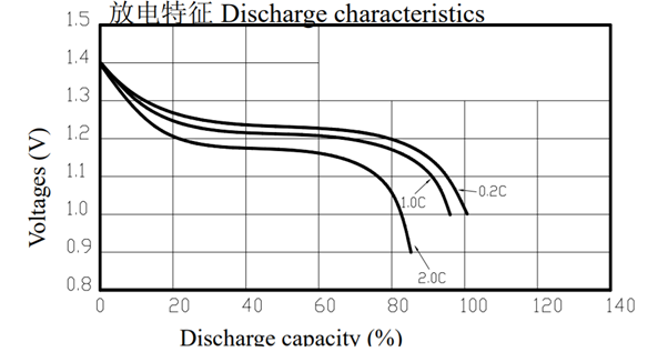
Figure 1: Discharge profile of the rechargeable AA batteries
In this activity we will be plotting the change in voltage against time to produce a discharge profile for your cells.
You Will Need
- The Fully Electric Challenge Pack, specifically:
- BBC micro:bit GO Pack
- A computer/laptop with internet access
- Data collected from yesterday’s session
- Access to Google Sheets
Note: If there any issues were collecting your data, there will be a set of model data under Day 3 on the Google classroom platform.
Locating your CSV files on your computer
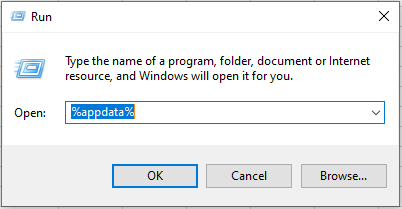
If you forgot to click “Save As” on your collected data yesterday or you can’t find where you saved it, this section is for you. For Windows users, hit “Windows key” + “R” to pull up the run prompt, then enter the command “%appdata%” and hit ENTER:
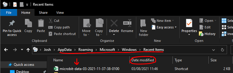
Then navigate to “Microsoft” > “Windows” > “Recent Items” and sort by “Date Modified” to bring your most recent items to the top. Here you should find your .csv data!
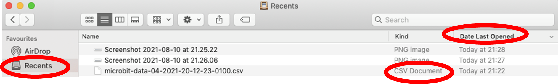
For Mac users navigate to the “Finder” application. You can normally find this on the dock.

On the left-hand side of the Finder window click ‘Recents’. You can sort by ‘Date Last Opened’ to bring up the most recently opened items to the top of the list. Here you can find your .csv data.
How to import CSV files into a Google Sheets Spreadsheet
CSV stands for “comma-separated values”. A file type contains a list of data separated by commas. They’re commonly used to exchange data between an instrument, such as a sensor, and can be opened with many different programs. Commonly a spreadsheet such as Google Sheets or Microsoft Excel is used to access the data found in a CSV file.
To open a CSV file into a Google Spreadsheet:
- Open Google Sheets
- Choose “File” > “Import” > “Upload” > “Select a file from your device”
- Choose your CSV file from wherever you saved it
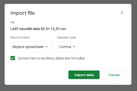
- Then a window to import the file will pop up. Select the “Import location” to Replace spreadsheet, the “Separator type” to be a comma and tick the box to convert text to numbers, dates, and formulas.
Plotting your characteristic curves
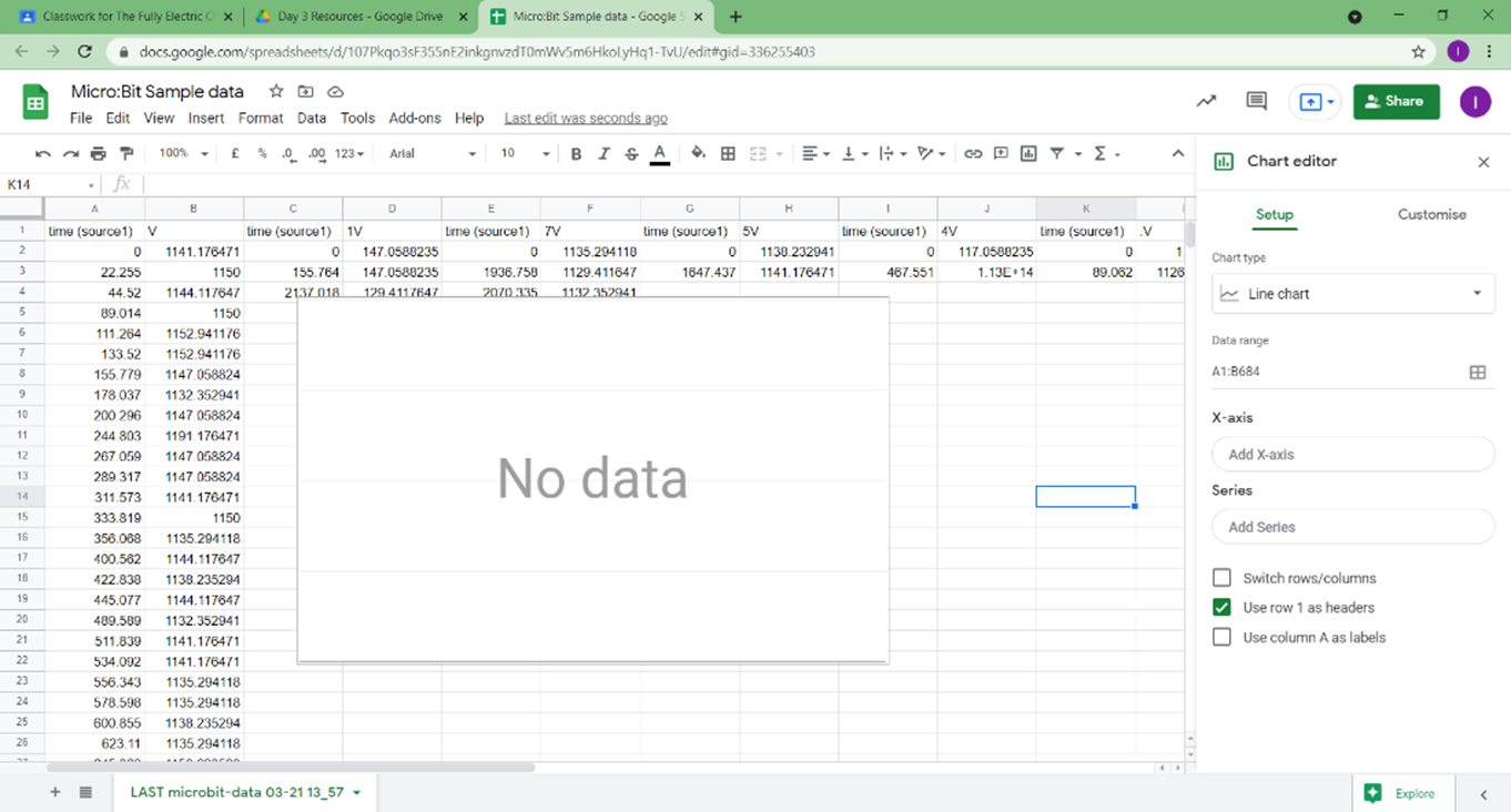
Step 1: In your new spreadsheet you need to plot your time vs. voltage graph with your data. Click the Insert tab and press chart. The chart editor should appear on the right-hand side of the spreadsheet panel. Select the chart type as ‘Smooth line chart’ and select the data range as the first two columns. Ensure that in the X-axis section the time column is highlighted and in the ‘Series’ section is the V column.
Step 2: Depending on how far you managed to discharge your battery, your graph should look similar to this!
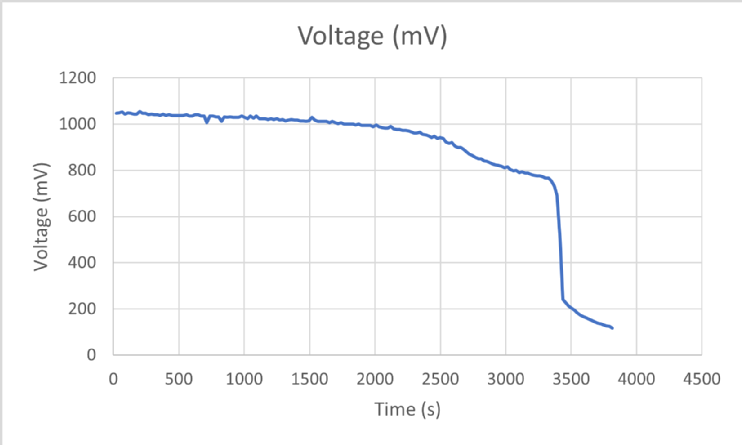
Step 3: Now we can add titles and units to the axis to avoid confusion. Remember for the vertical ‘Voltage’ axis the units of measurement are in millivolts or mV. The micro: bit measures the voltage on a smaller scale to get a more accurate reading.
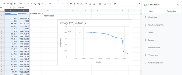
Step 4: Finally, customise the graphs as you like and compare them with your breakout groups if there are any differences in your data. You can include your voltage profiles in your presentation.